Redesigning a subscription based donation platform
-
The Project
Web Redesign,
UX Research -
My Role
Product Design Lead
-
Timeline
12 Weeks
-
Tools
Figma, Sketch, SurveyMonkey, Excel, Maze
-
Status
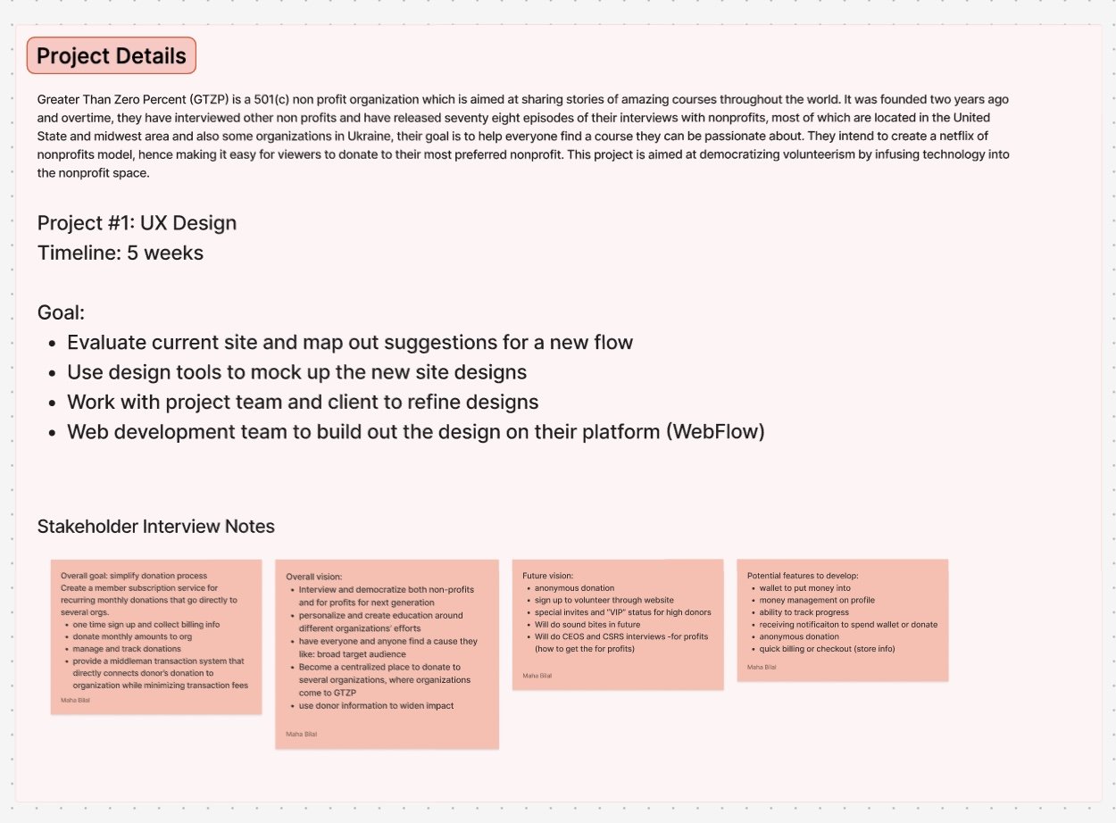
A Netflix for Nonprofits
Greater Than Zero Percent’s mission is to allow users to discover non-profit organizations that align with their values in a “Netflix style” gallery of video interviews and media. The goal is to encourage monthly donation via a free membership service. This organization aims to automate the donation process and increase visibility of smaller non-profits.
The Redesign
GTZP aimed to enhance the user experience on their website and sought the assistance of benefit.design to optimize their website design for both business and user objectives.
76.9% improvement in average usability test scores
"[Donating] was very quick, easy, and clear"
88.9% increase in donation conversion rate
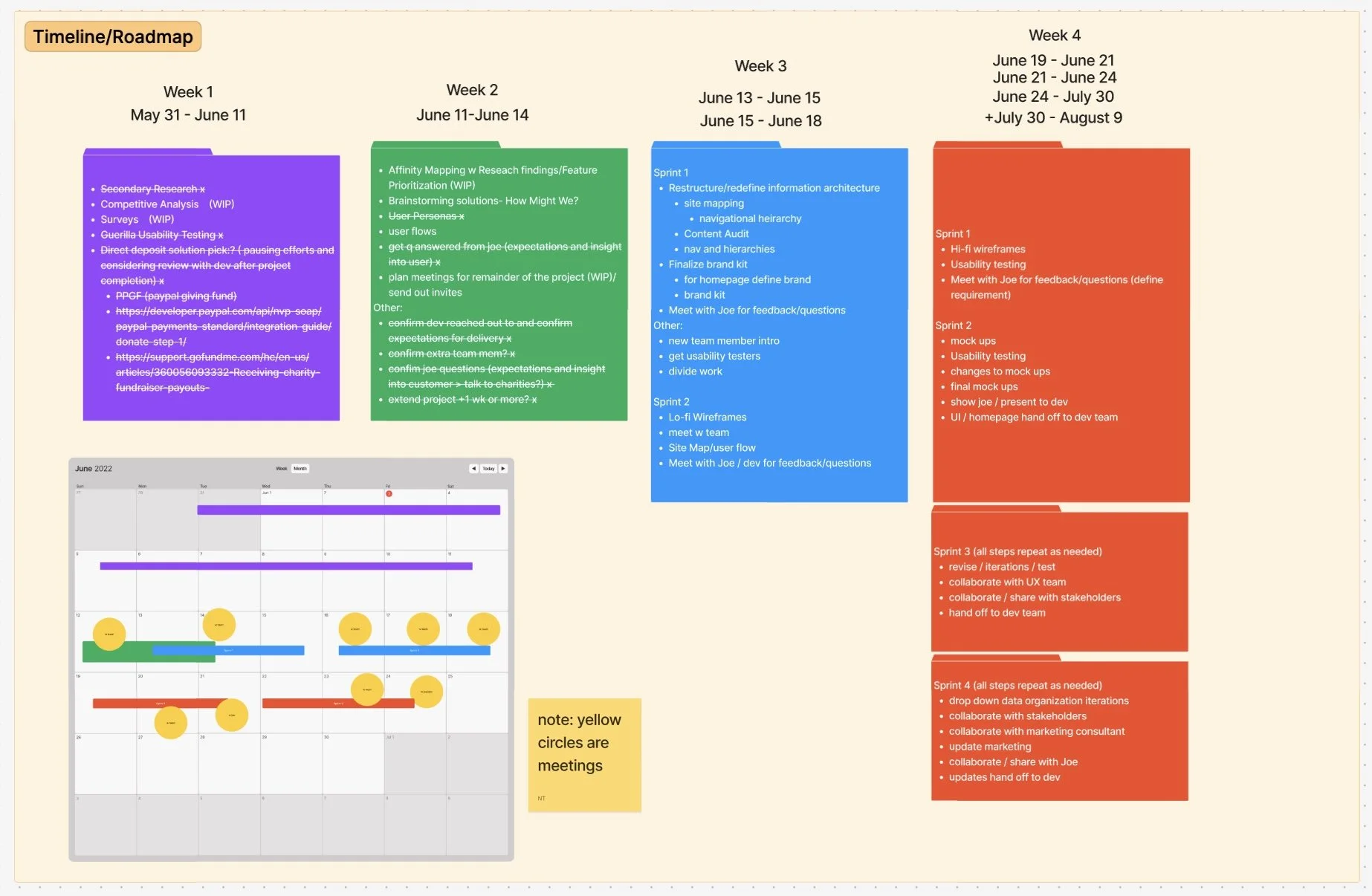
Project Planning
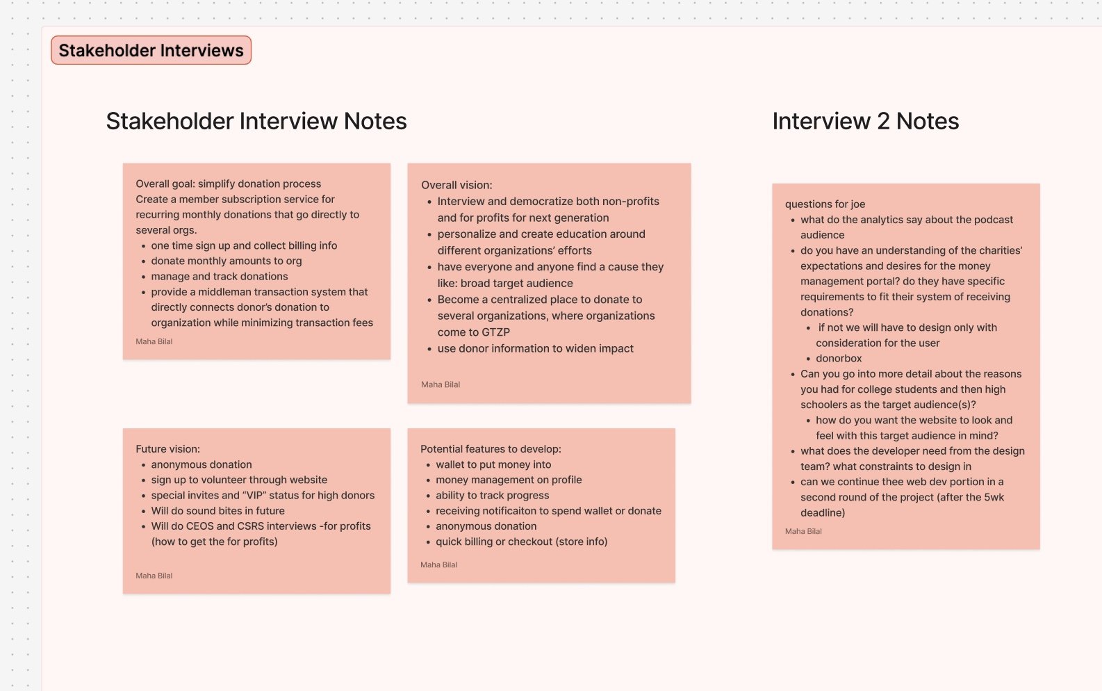
Appointed as the design team leader, I created a project timeline to last a 8 week period. I set weekly target goals, regular meetings to ensure stakeholder alignment, and left time to incorporate feedback into iterations. I led each stakeholder meeting and wrapped up with notes for the team to refer back to.
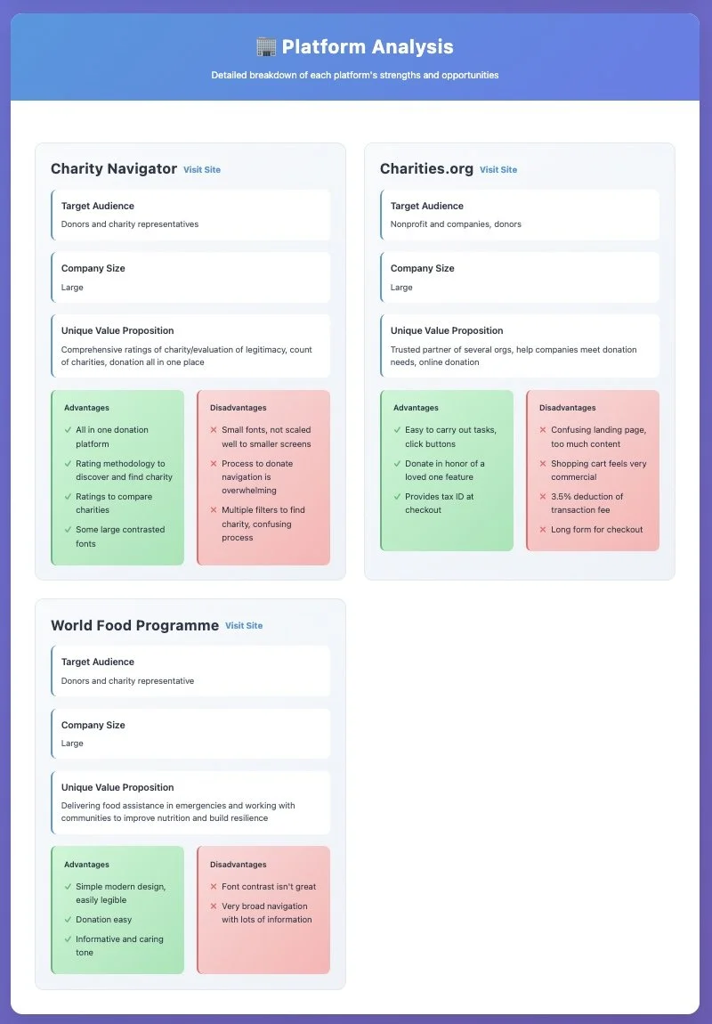
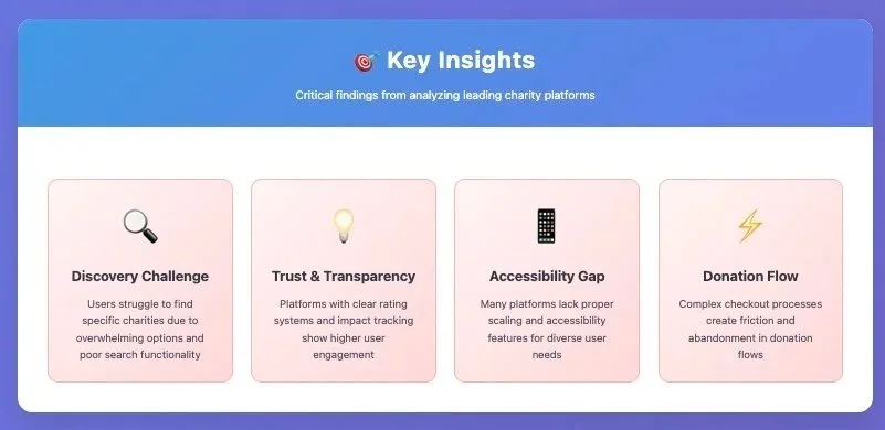
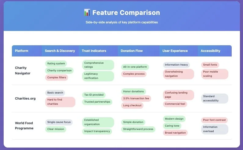
Competitive Analysis
We conducted a competitive analysis to understand other popular charity platforms. From this, we gained insight on what features to highlight on the website and our target audience.
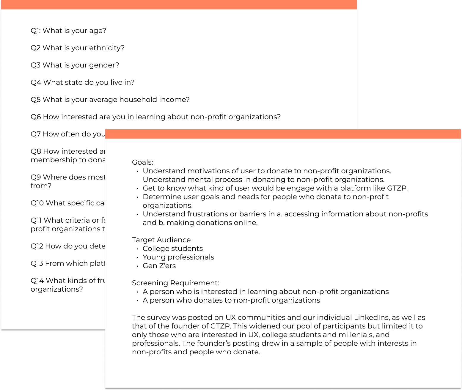
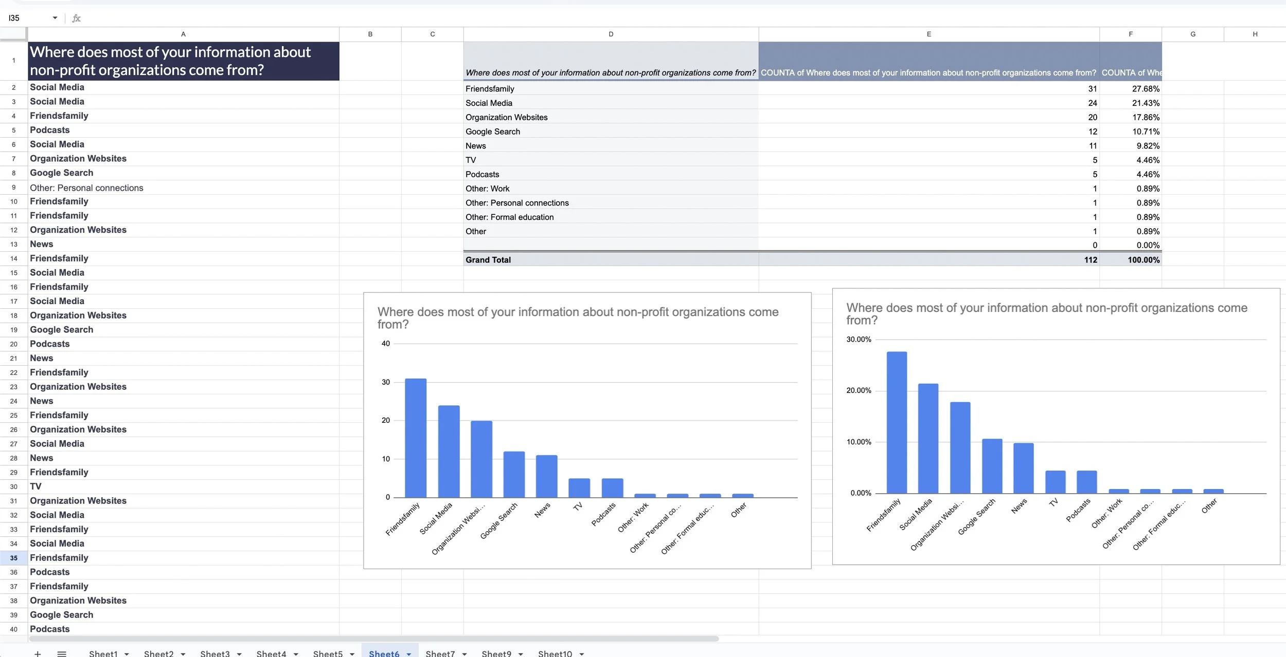
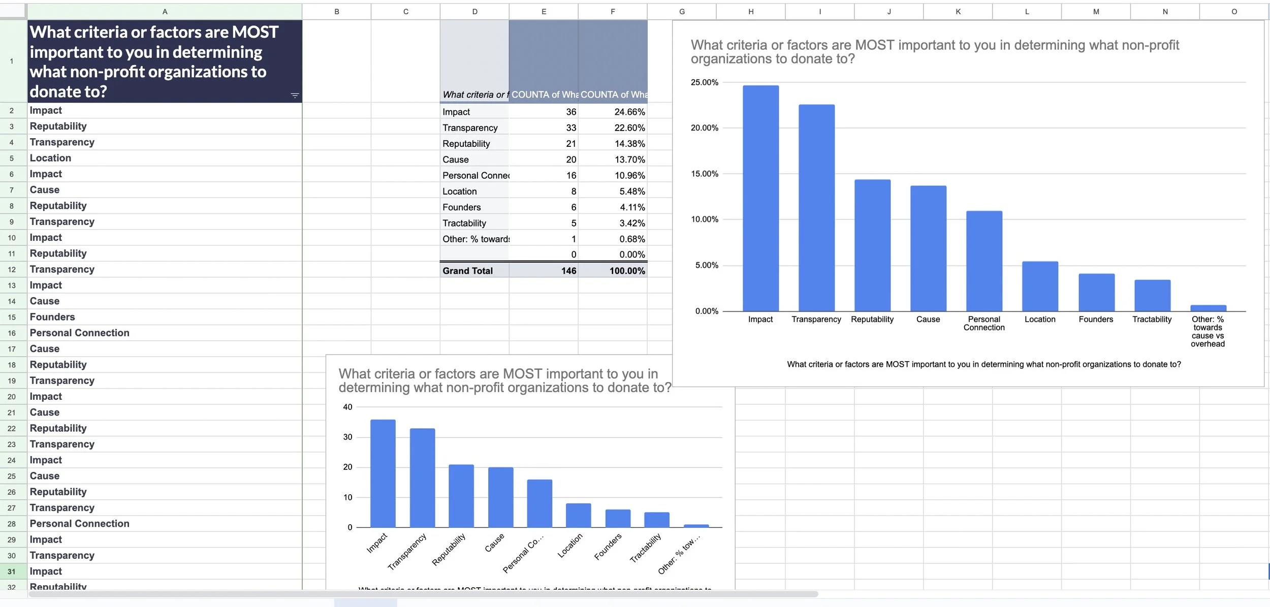
User Surveys
We conducted user surveys using randomized samples on SurveyMonkey to understand user behavior in the context of donating to charities:
user demographics
donation criteria
popular causes
popular donation platforms
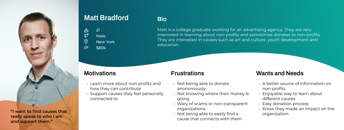
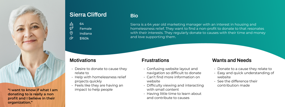
User Personas
Usability Testing
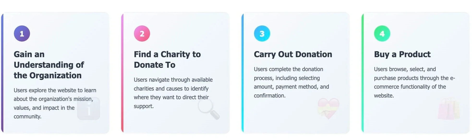
We conducted usability testing based on different pathways that a user would take on the website. This allowed us to determine the exact usability issues and pain points on the website preventing users from signing up for membership and donating.
We asked users to complete 4 tasks and observed the click paths, user comments, emotions, and the reported level of difficulty of each task.
Affinity Diagramming
We then synthesized our usability test findings to uncover patterns and targetable pain points using affinity diagrams. We incorporated user quotes to paint a clear picture of user's frustrations.
We organized findings by three key user motivations:
clarity, connection, and purpose.
Each of the pain points along the user journeys tested were further categorized by their click paths as errors of interaction, UX writing, or visual confusion.


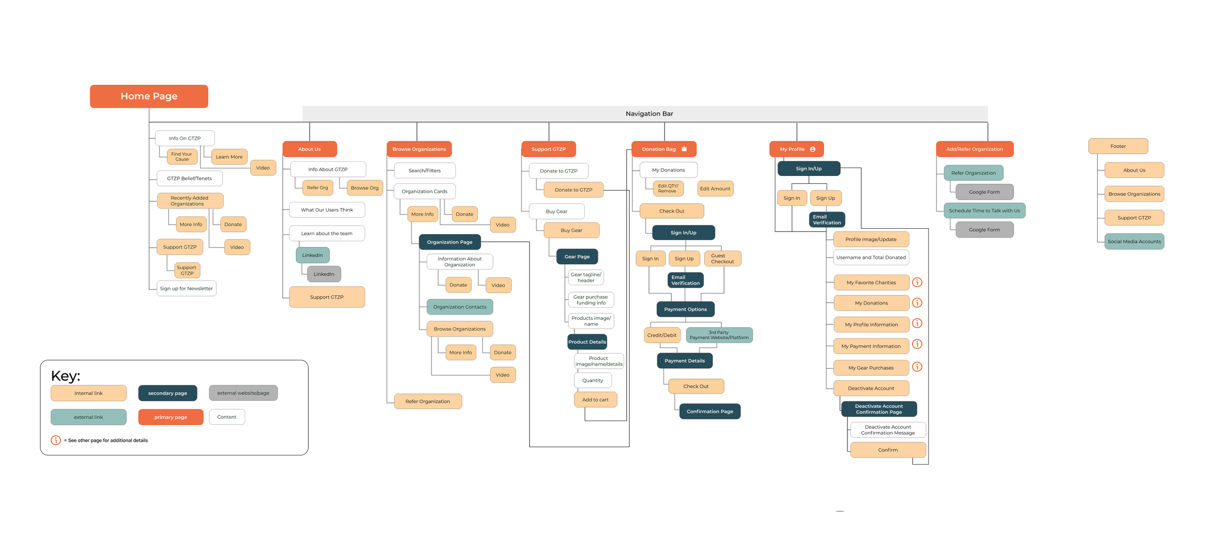
Site Maps
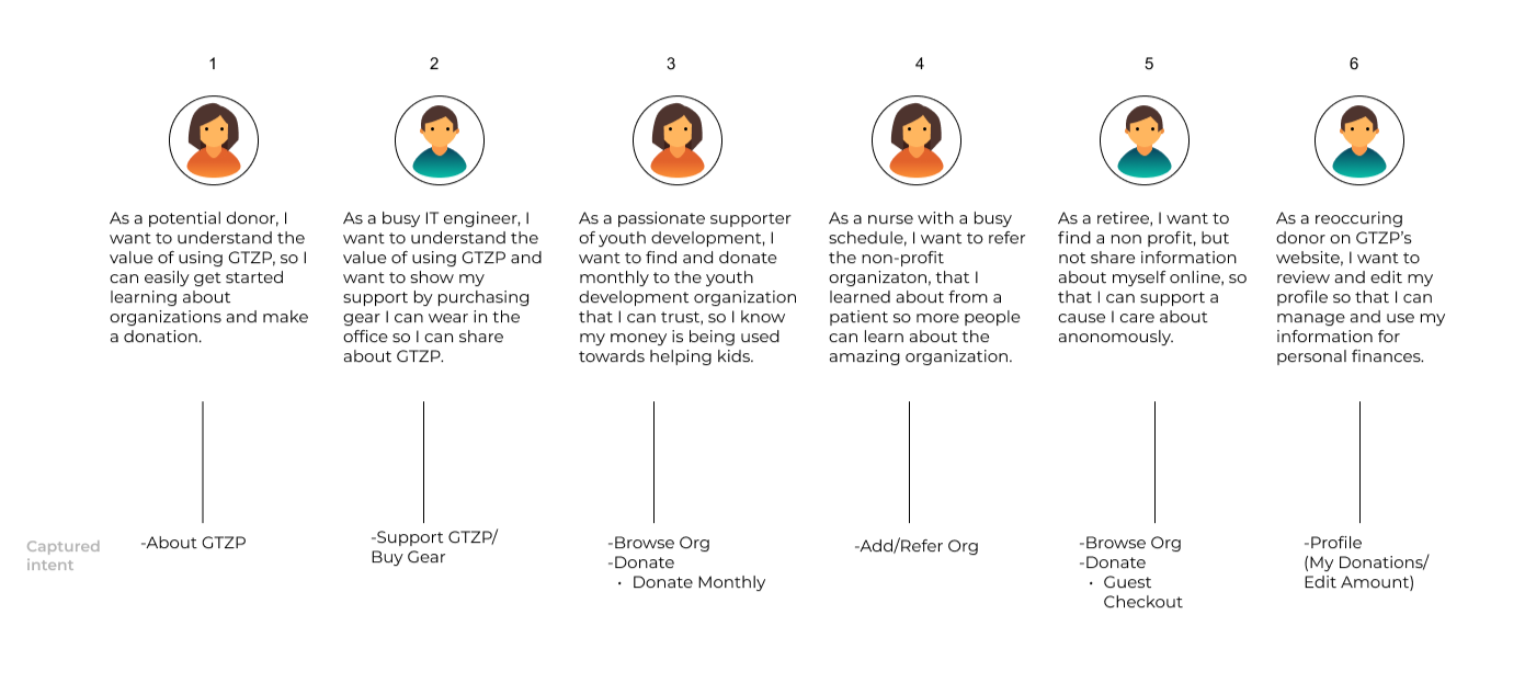

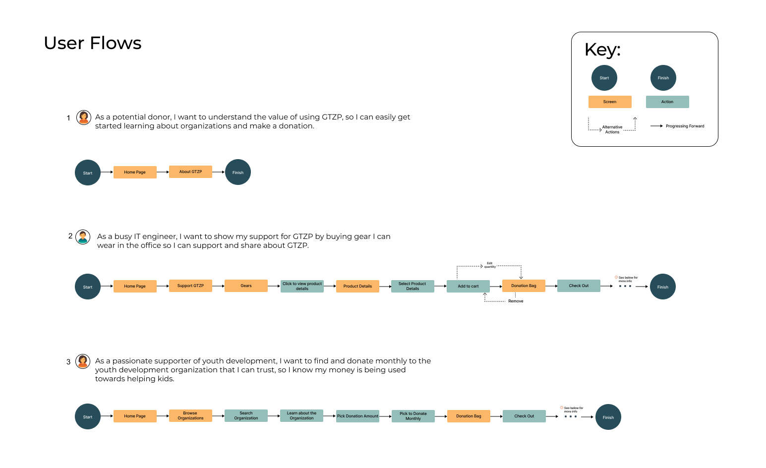
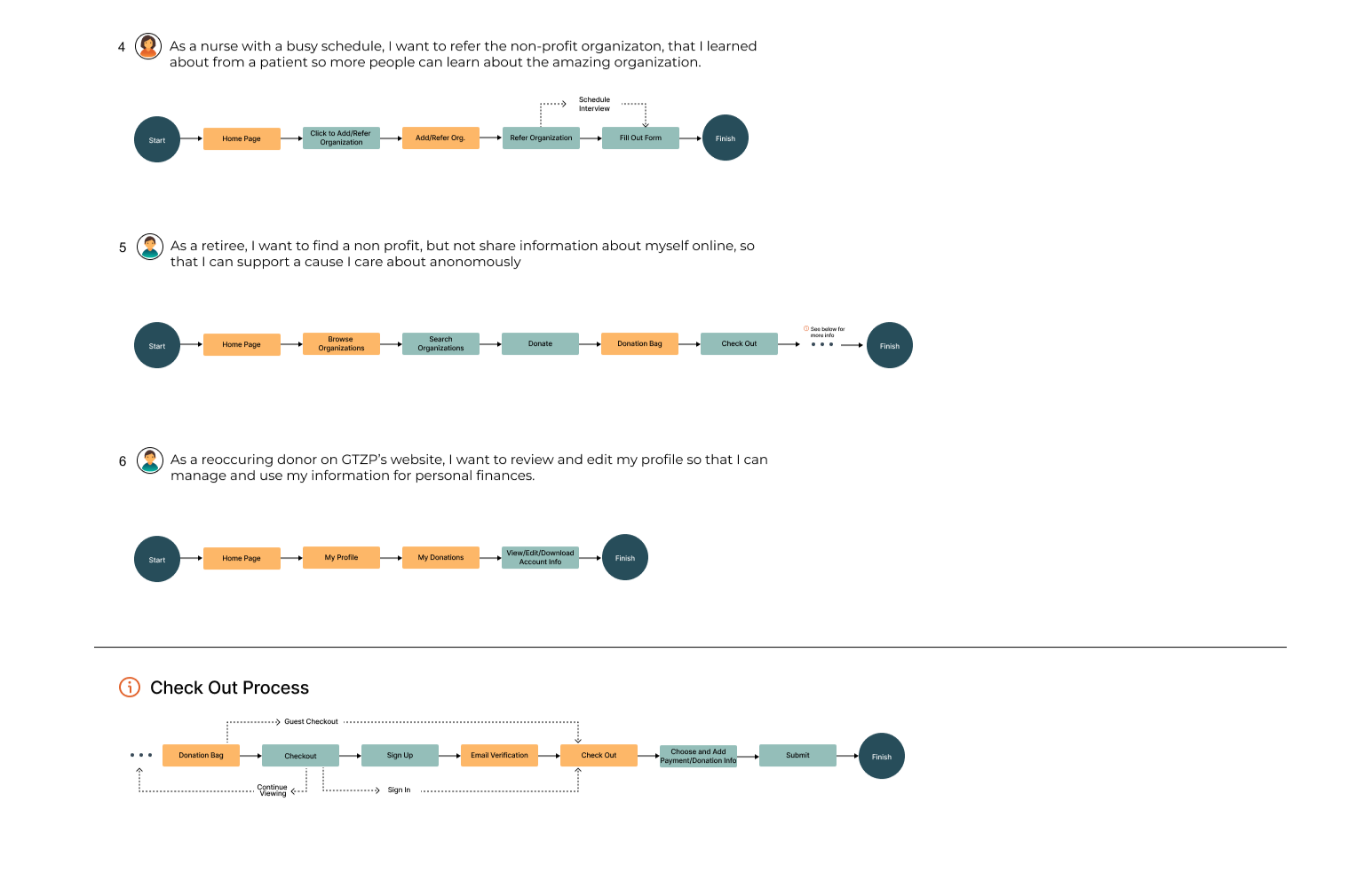
User Stories
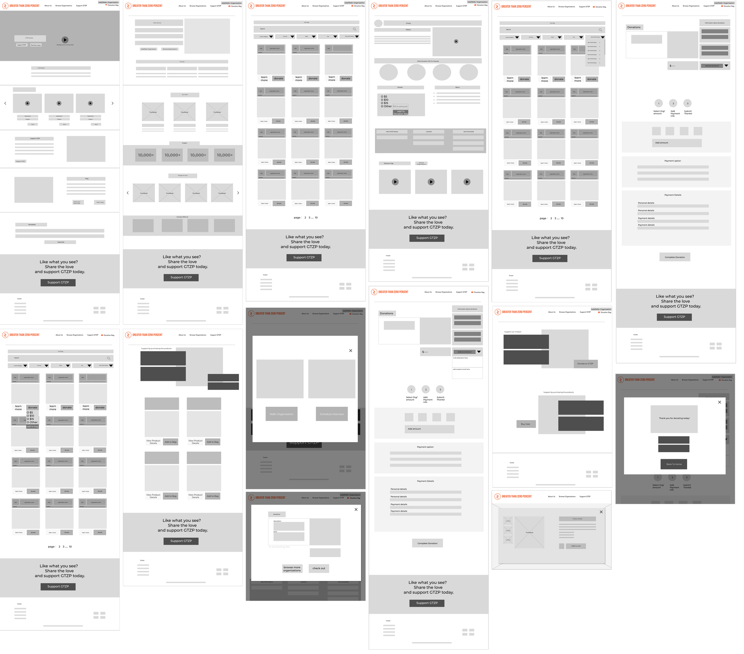
Lo-Fi Wireframes
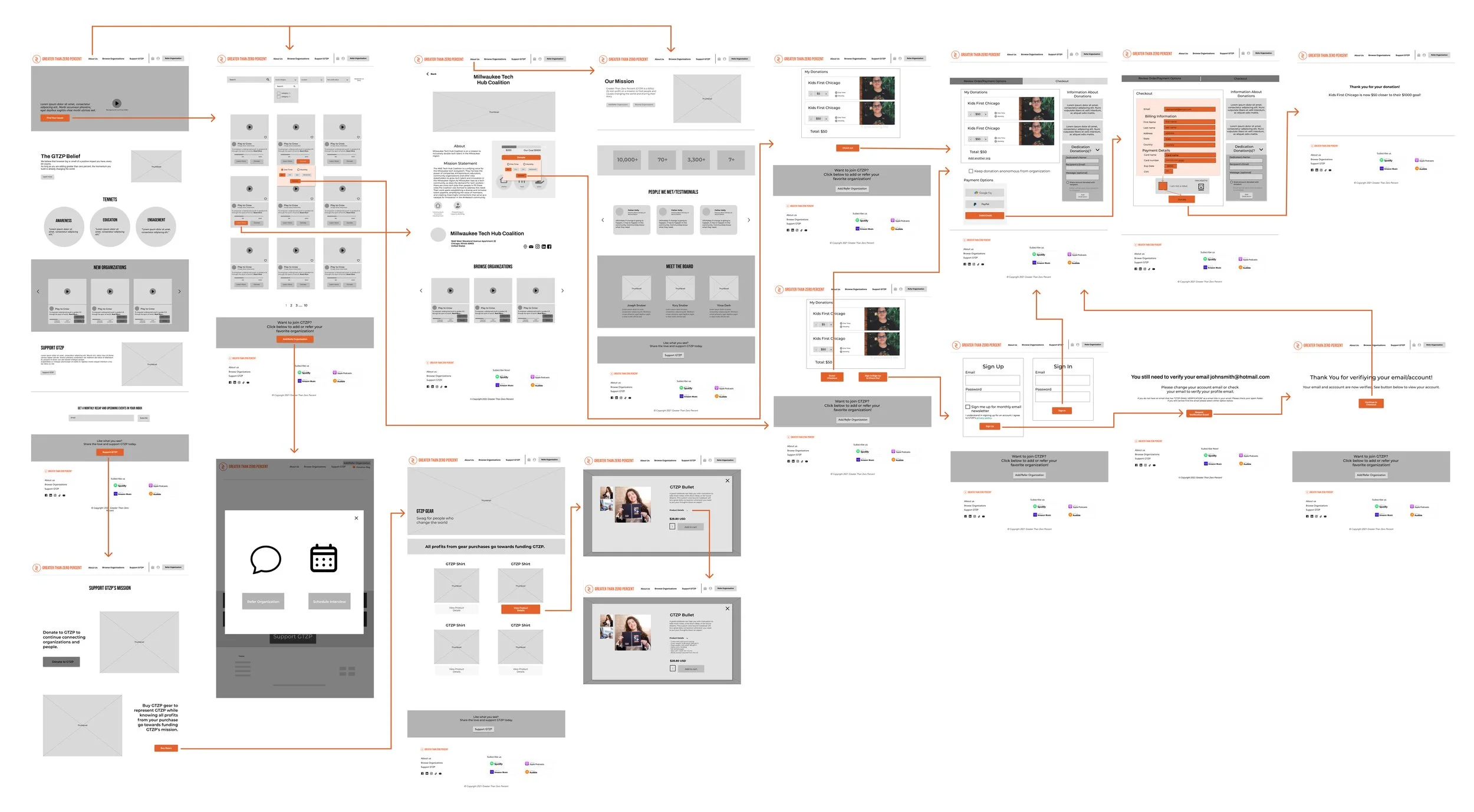
Discover and Donate Prototype
Shop and Donate Prototype
Style Guide
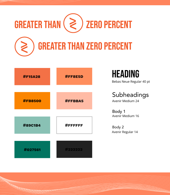
I proposed a colorful and engaging style guide reminiscent of Netflix that the founder approved of.
Hi-Fi Wireframes
Main Navigation
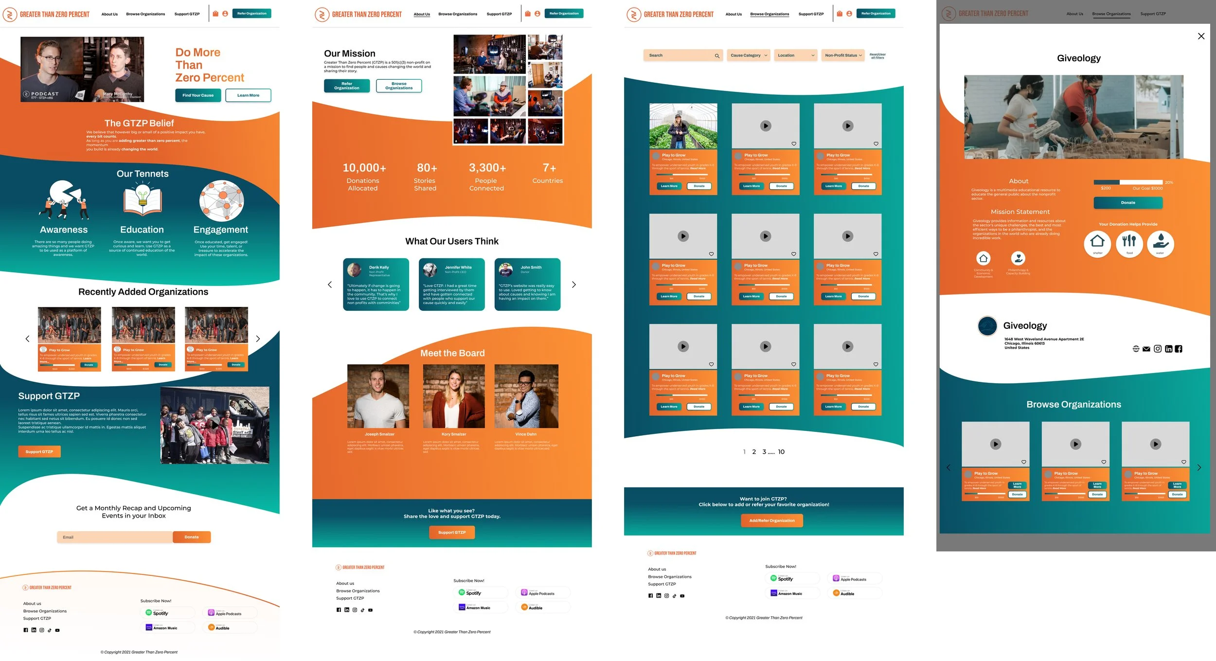
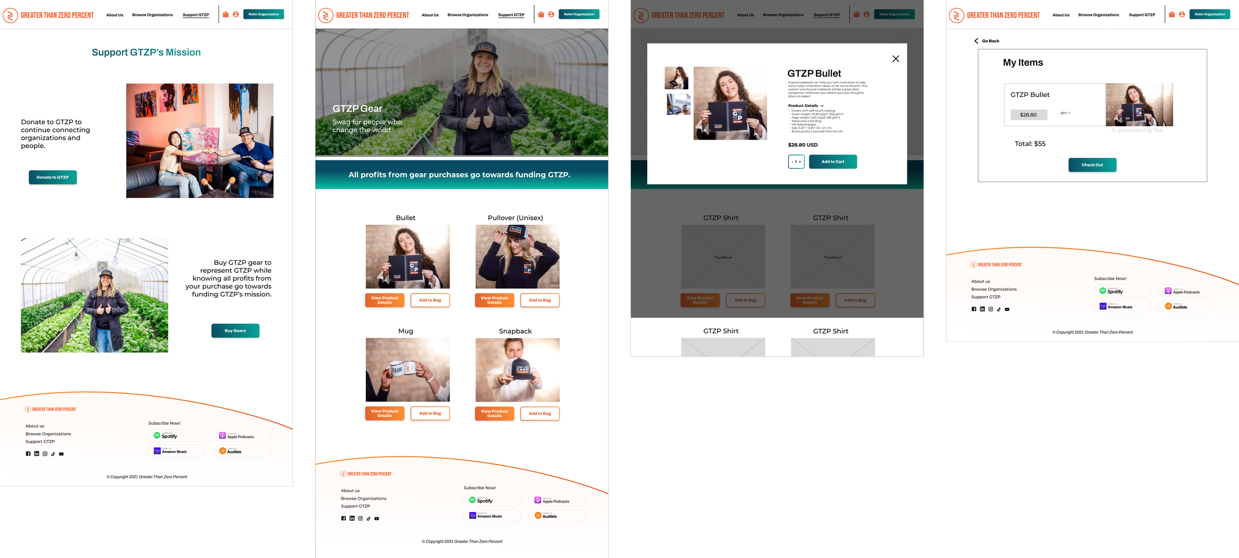
Merchandise Shopping
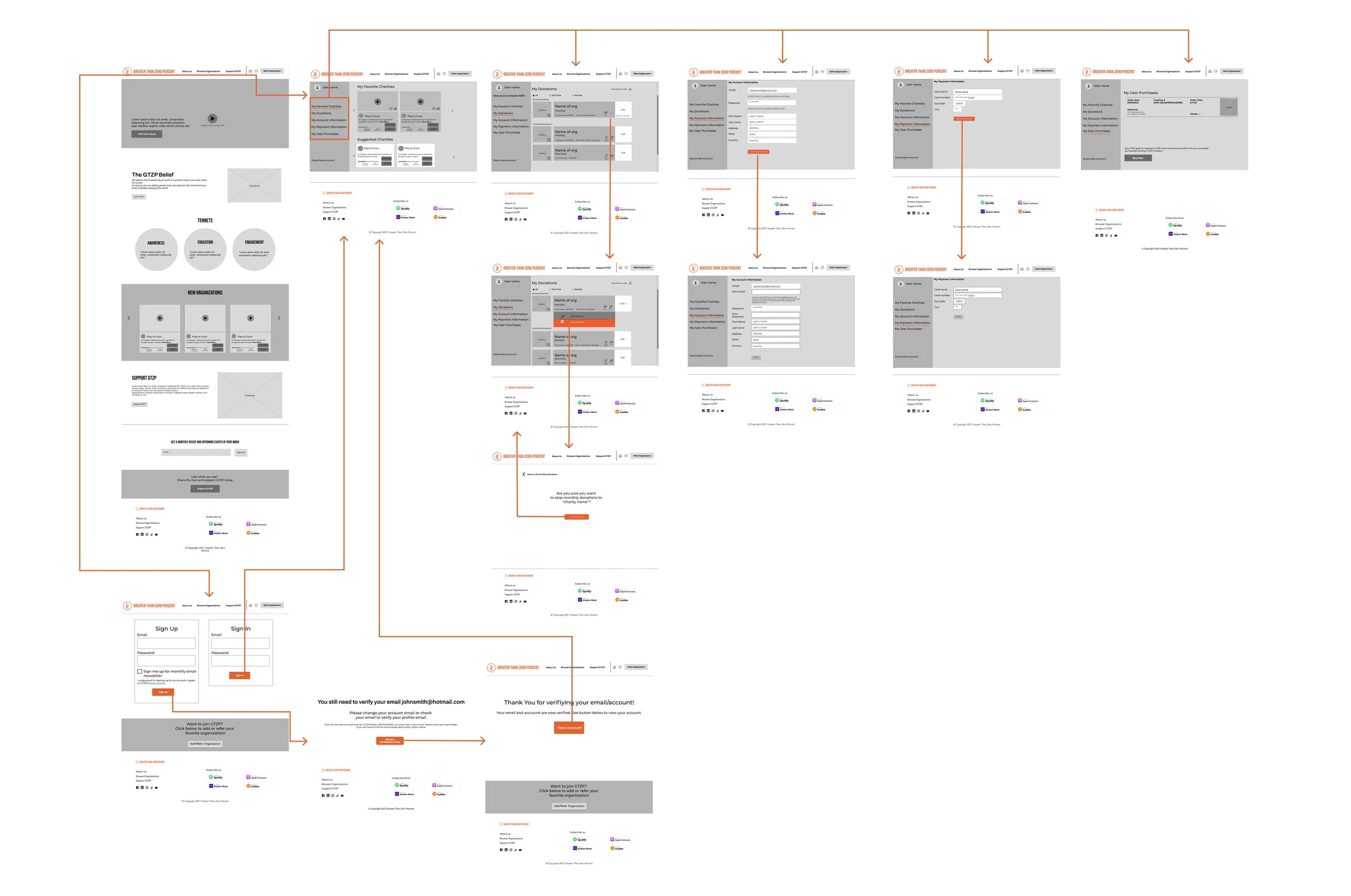
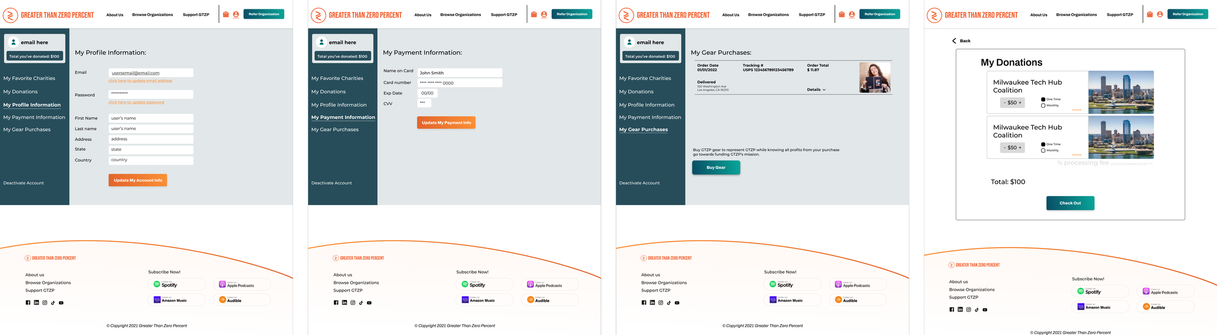
User Profile
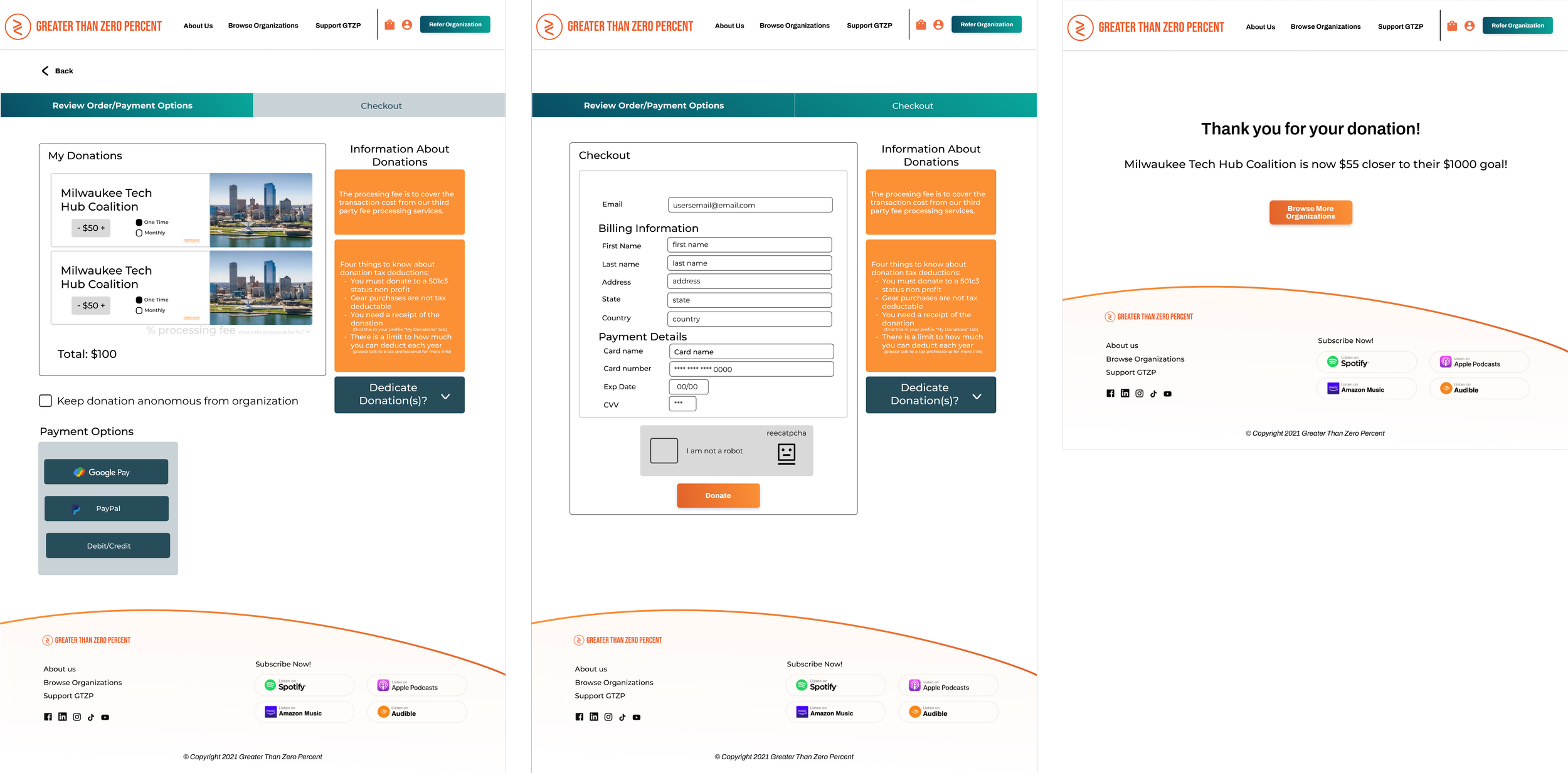
Checkout
Greater Than 50% There…
At this point, the project was passed back to the founder and handed off to developers. Design is half of the process, with development, testing and iteration the next steps to making a perfect product.
Check out my other projects!