Redesigning an emergency EHR to streamline clinical workflows
-
The Project
UX & UI Redesign
-
My Role
Sole UX Designer, Brand Designer
-
Timeline
6 Weeks
-
Tools
Moqups, Figma
A UX Design Emergency
Discover and apply UX patterns to standardize solutions
Like many EHRs, Better Day Health emergency EHR was very out of date. With dozens of interaction flaws and unintuitive design, physicians and nurses using the interface were frustrated in carrying out their daily workflows.
Solve major usability and interaction errors
Simplify design for modern
look and feel
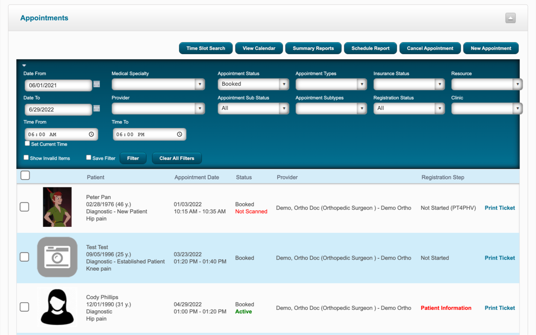
Original
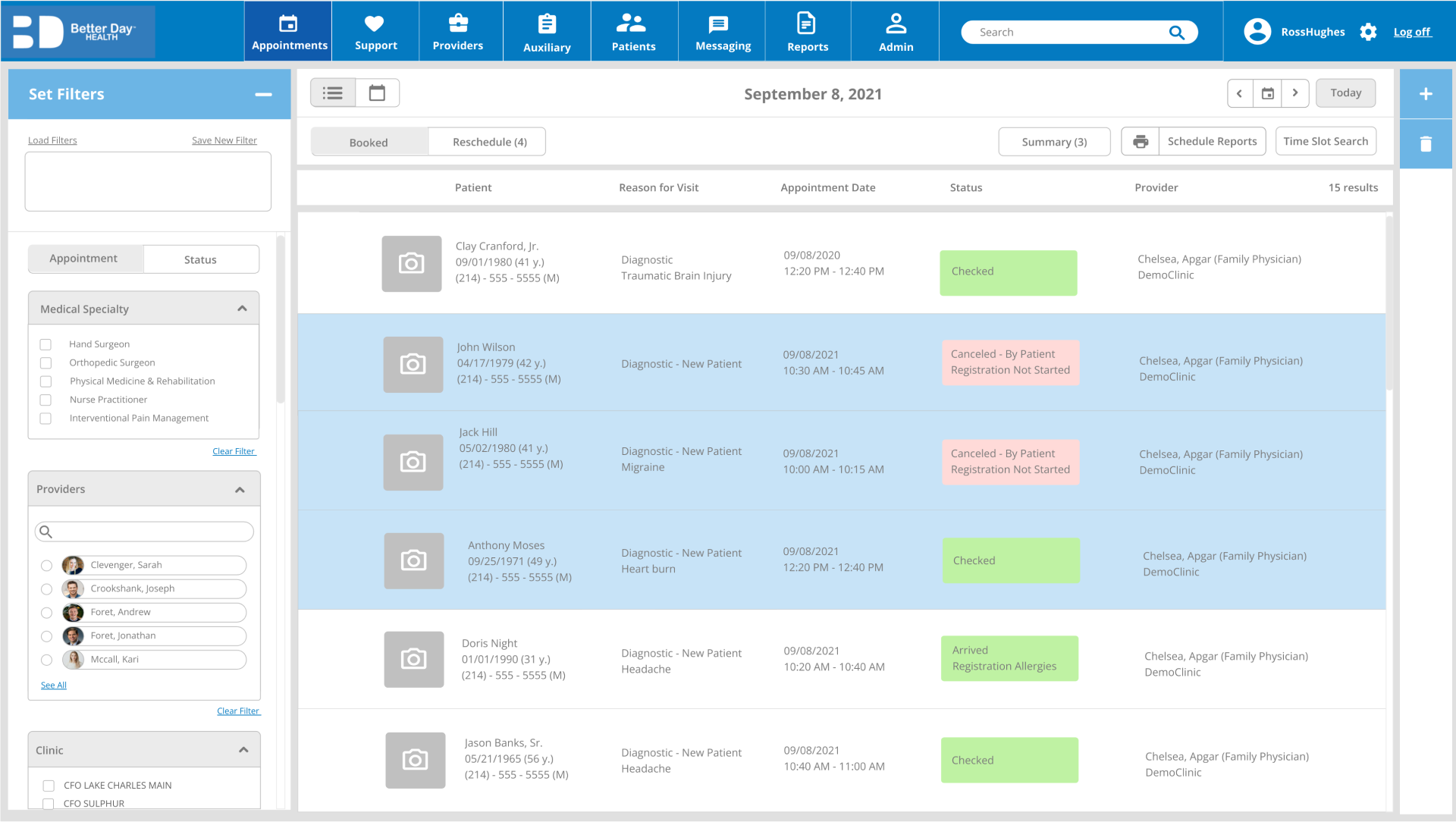
Redesign
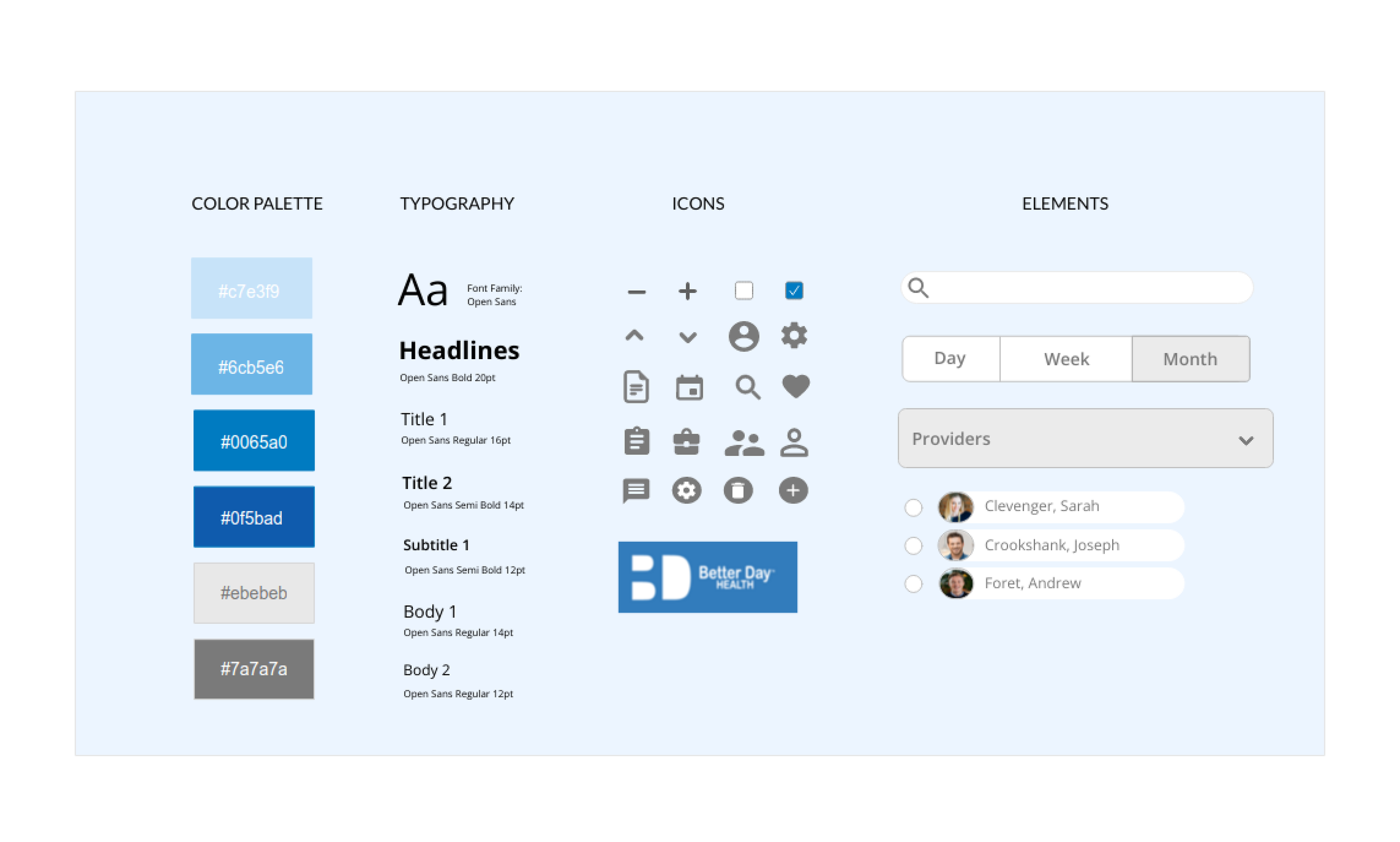
Style Guide
UX Pattern Guide
As per stakeholder requests, I created a UX pattern guide by auditing the current system, spotting major design flaws, and presenting a glossary with UX best practices based on common UX patterns to be used in the redesign. This helped to make the design process more efficient and consistent, supported by strong design thinking.
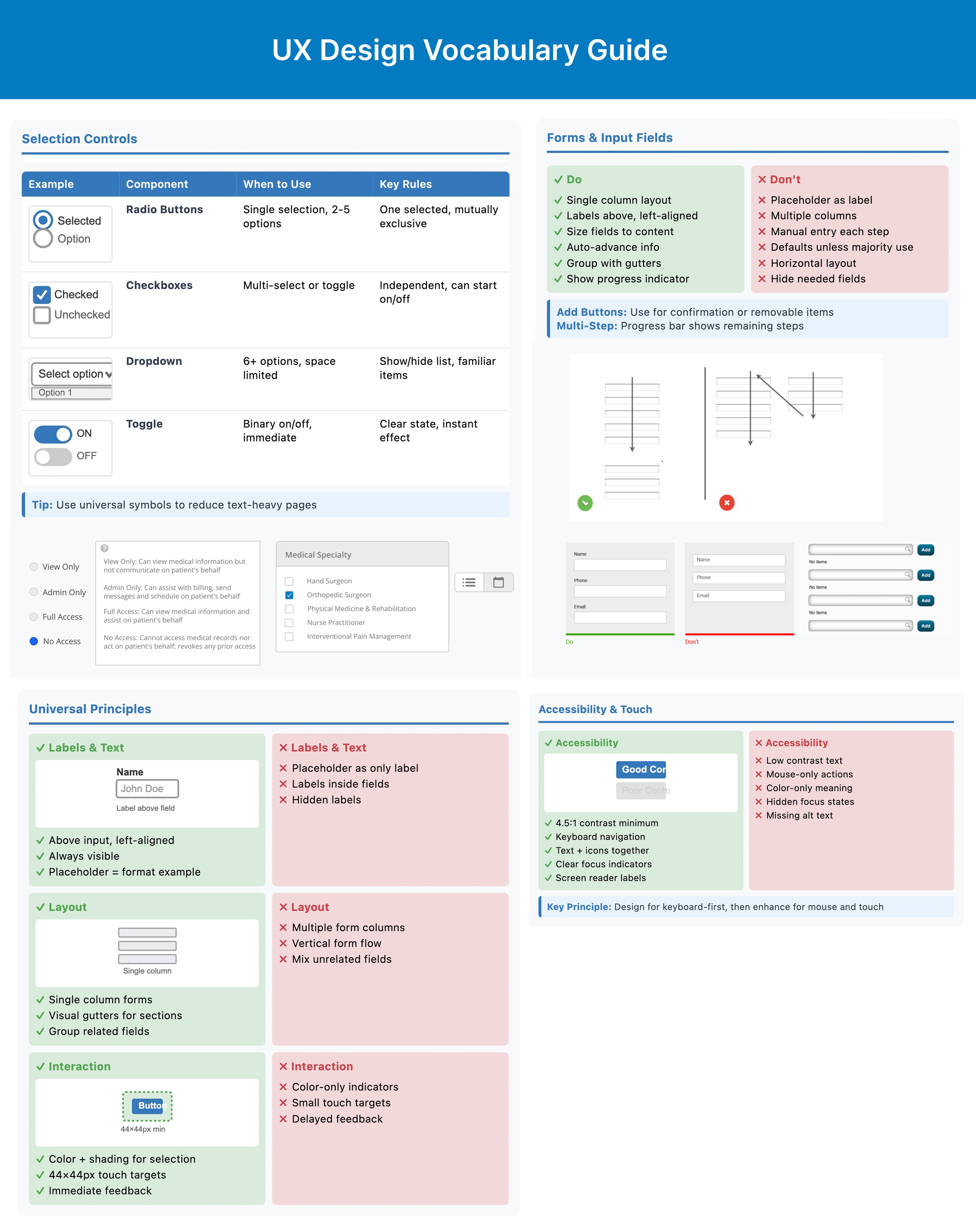
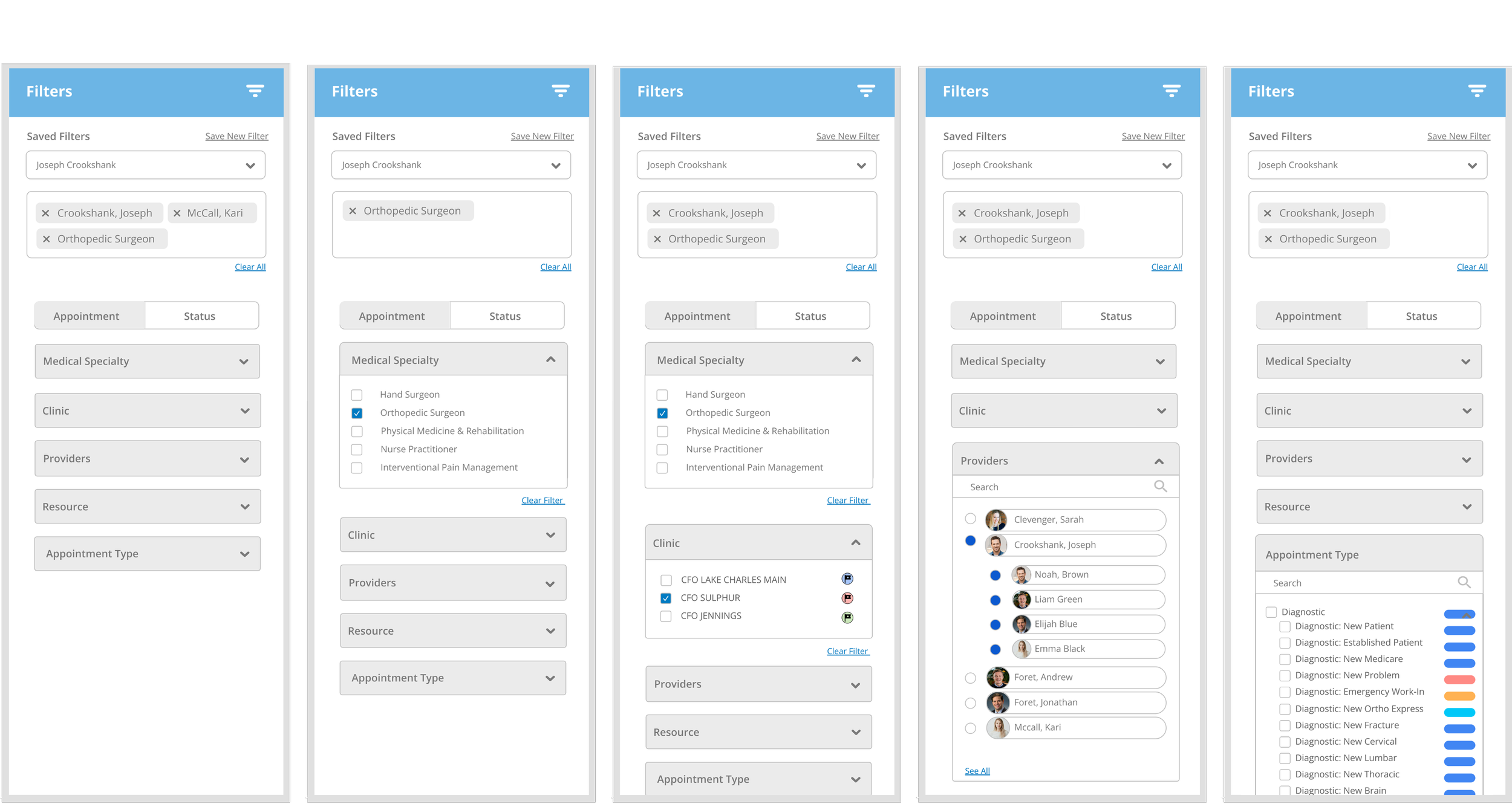
Filter UI Pattern
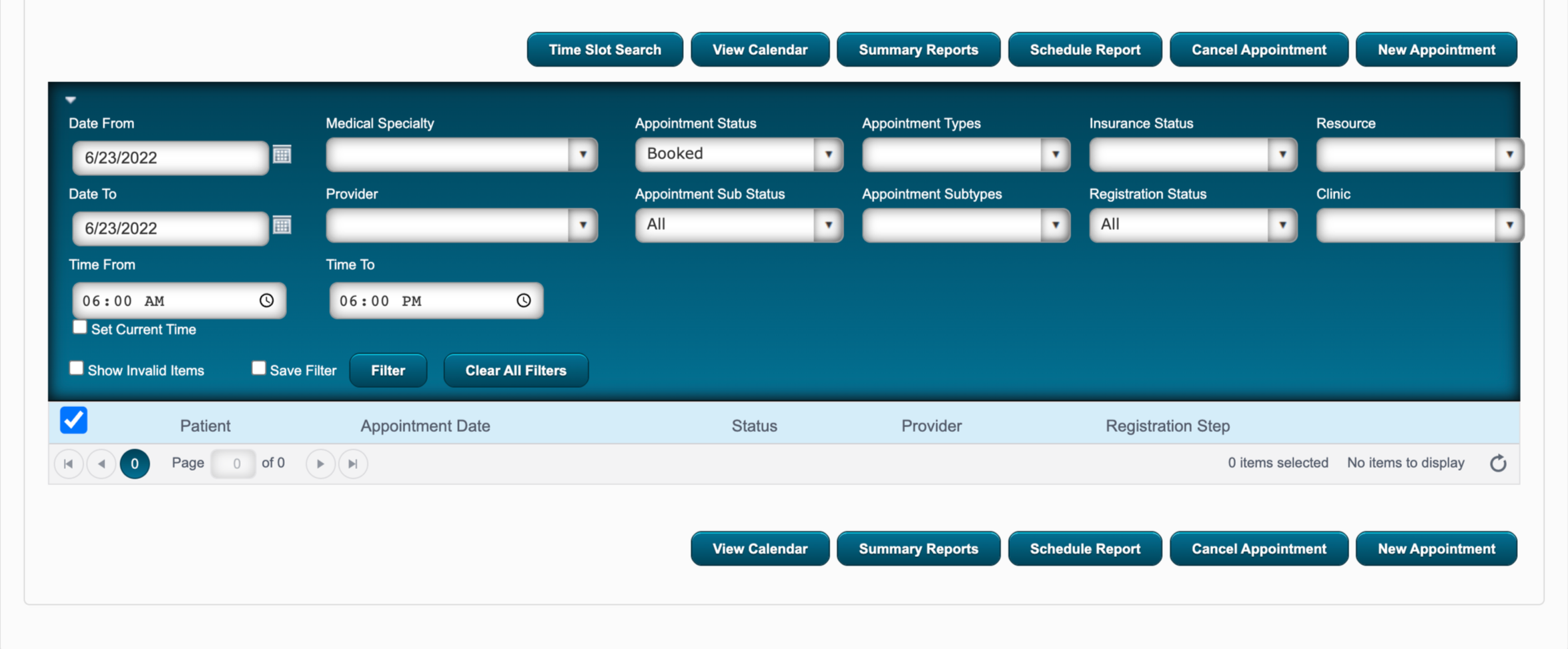
filters divided by either appointment or status types
unnecessary filters cause cognitive overload
optional/missing details causes info to be excluded
no visual hierarchy for filters and subtypes
no easy way to deselect filters without removing all
filter box containing selected filter tags with easy removal
option to load or save filters for shortcuts
filter hierarchy with intuitive narrowing selection
dropdowns within filter sidebar to avoid covering information
The previous filter system was confusing, lacking hierarchy, and led to missing information depending on the users’ order of selection.
search bar within filters
Calendar Redesign
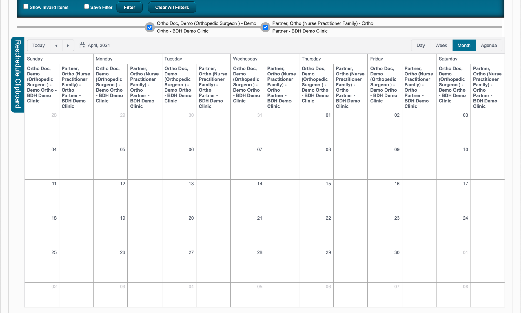
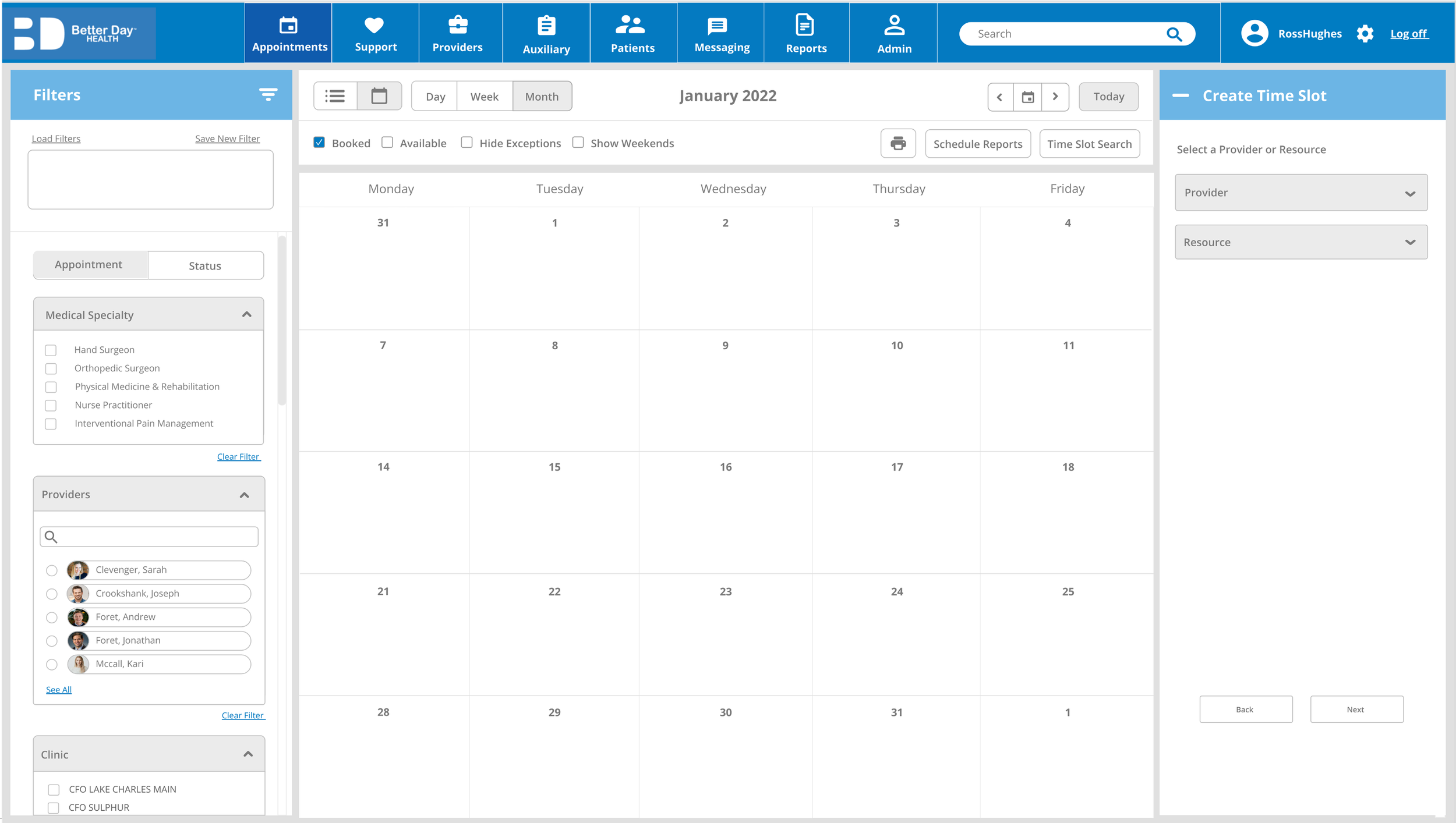
complicated filter system with conflicting selections
tiny calendar boxes
check box for “booked” vs “available” separate from filter box to change view
calendar split by provider and partner views
collapsible sidebars containing filters
full calendar view by default to fit on one screen
quick appointment booking on calendar view
Calendar Appointments
With stakeholder approval, I added a new feature to enable users to quickly schedule an appointment directly on the calendar view, while using filters to view other clinics and providers.
This resulted in more flexible and faster scheduling.
Appointment Search

user must scroll back up to make actions on selected options

collapsible sidebar allows easy filter selection while scrolling through list
more info fits on the screen
Nurses/office admin typically search for appointments by availability, then narrow by practice, physician or speciality.
A user might want to search for booked appointments at any clinic, or view the availability of a specific physician.
upper controls still visible while scrolling so user can print, make summary, add new appointment without scrolling back up
status box more visible
filters at the top block half of the search screen
user must scroll back up to edit filter selection
List UI Pattern
pages within list are unintuitive and easy to miss
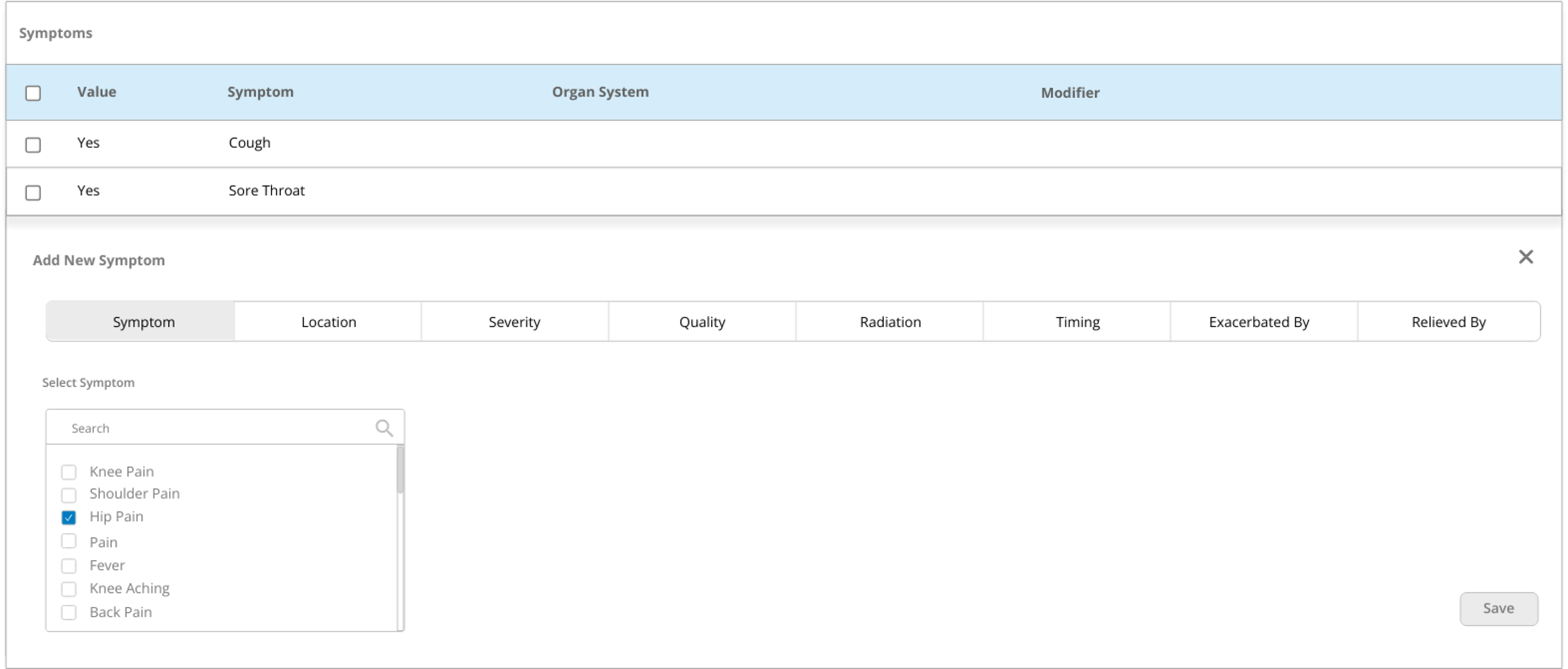
redundant action buttons
tabs options are redundant
Law of Locality: a new entry will appear where the user entered it
Check-boxes instead of “add” button and one “save” button to minimize user’s effort
options layout is both horizontal and vertical - should be single column
add, remove and edit: drop down sections within tabs to make changes directly on list instead of popup
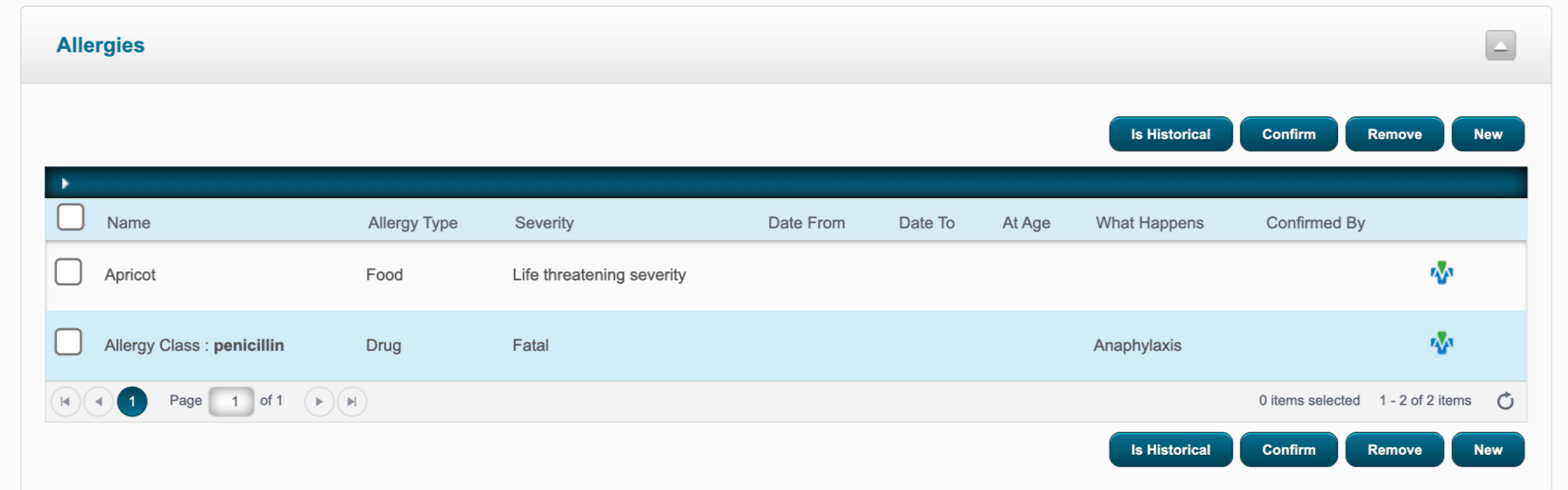
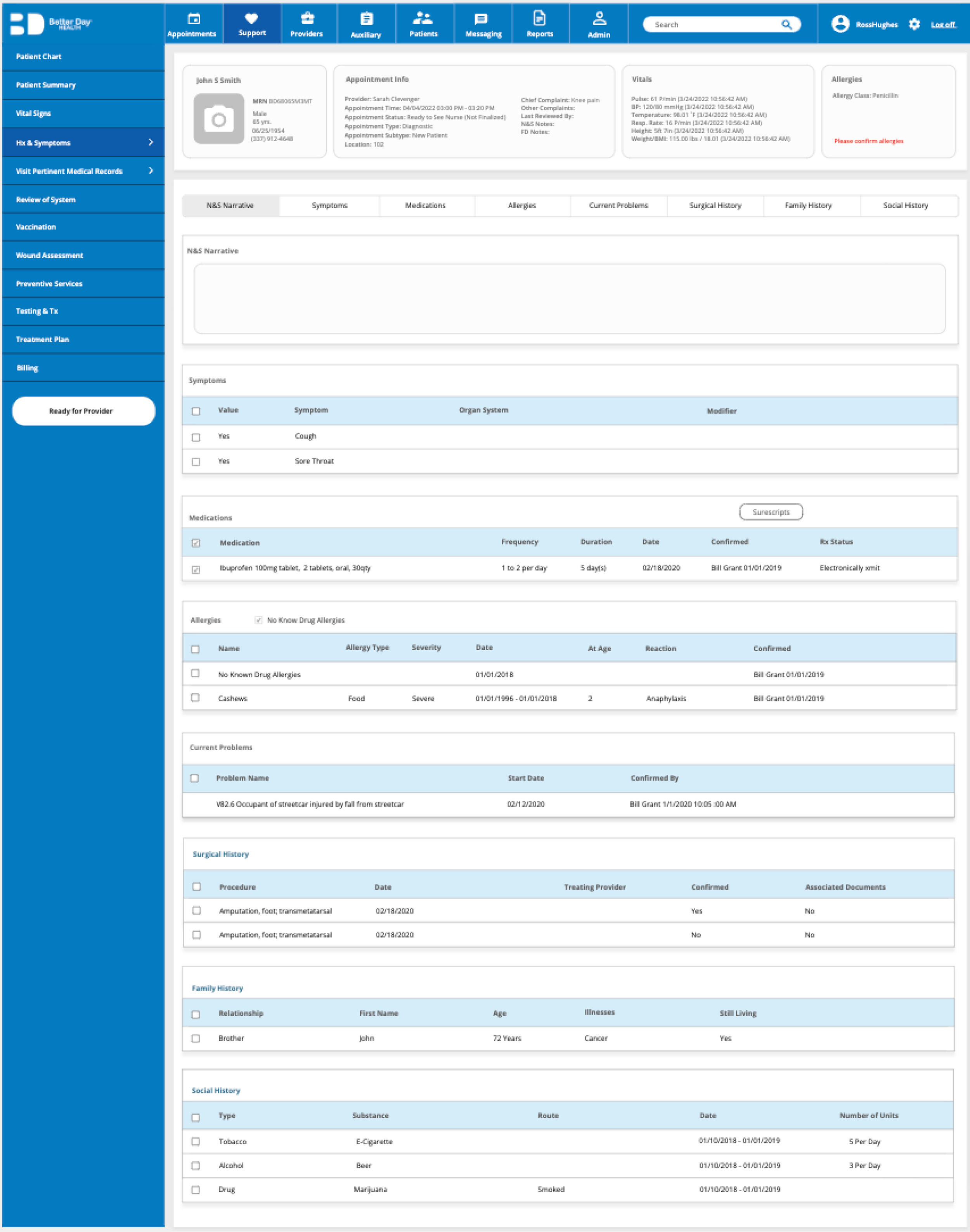
EHRs contain complex layers of information that healthcare staff interact with on a daily basis. Physicians need to access each patient's medical history and symptoms, containing medications, allergies, previous diagnoses and more, before each appointment. Navigating through patient lists need to be as seamless as possible.
nested pop-ups without their own URL leading to more clicks and getting lost
Patient Info Lists
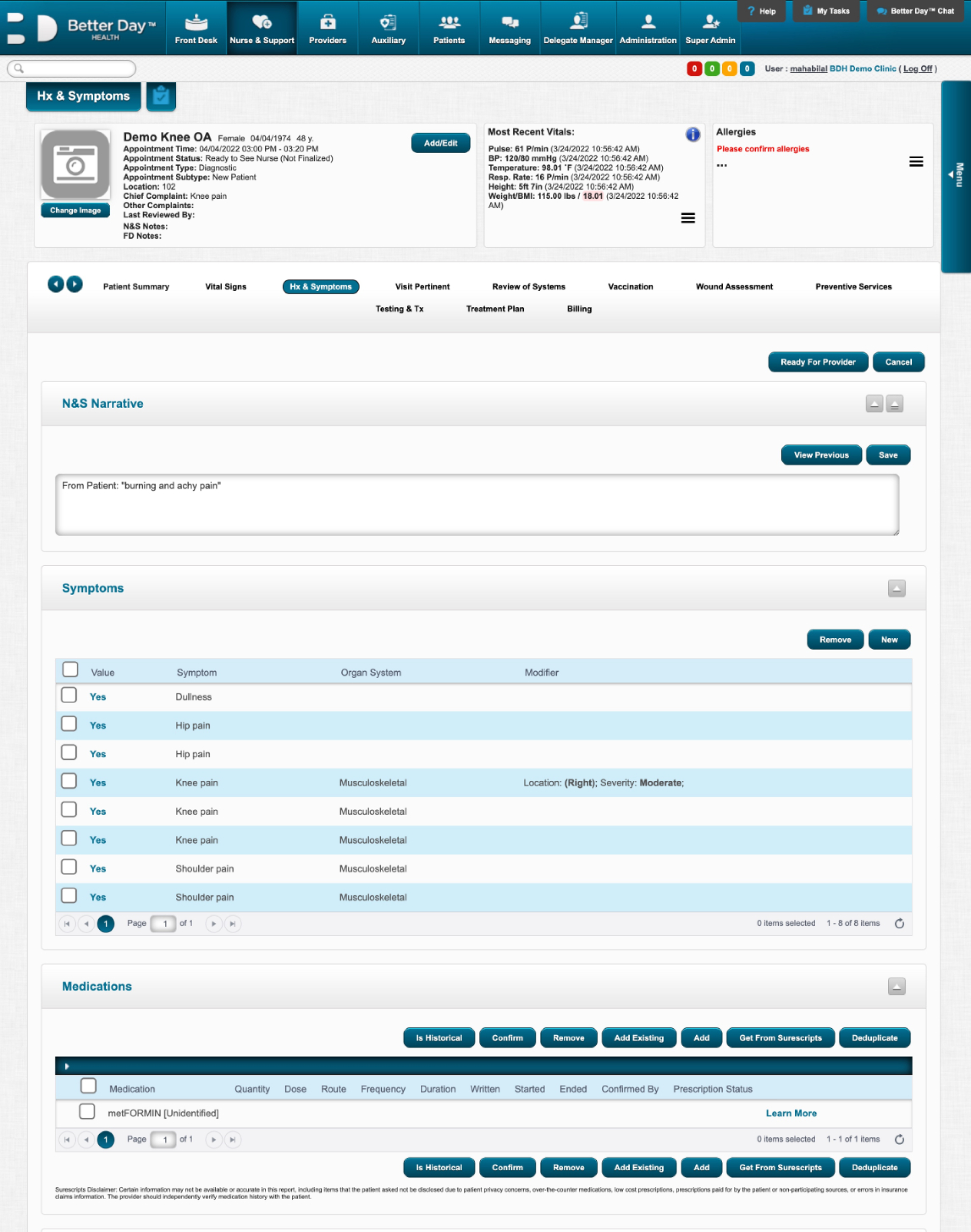
Due to HIPAA constraints, only the “minimum necessary” information is shown to certain users like healthcare admin, while physicians are allowed to access full patient histories. I designed the patient screen that would contain the most information, moving in order of decreasingly complex design.
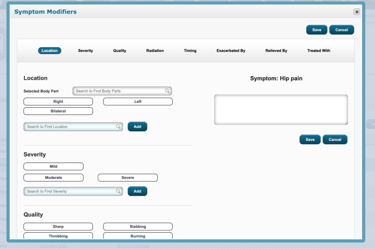
Appointment Scheduling
Lengthy forms are a tedious but necessary daily task for healthcare workers. This is a major part of the EHR portal that needs to be as seamless as possible.
global save button at top
info fits into screen
without scrolling
option to add appointment to combine user flows
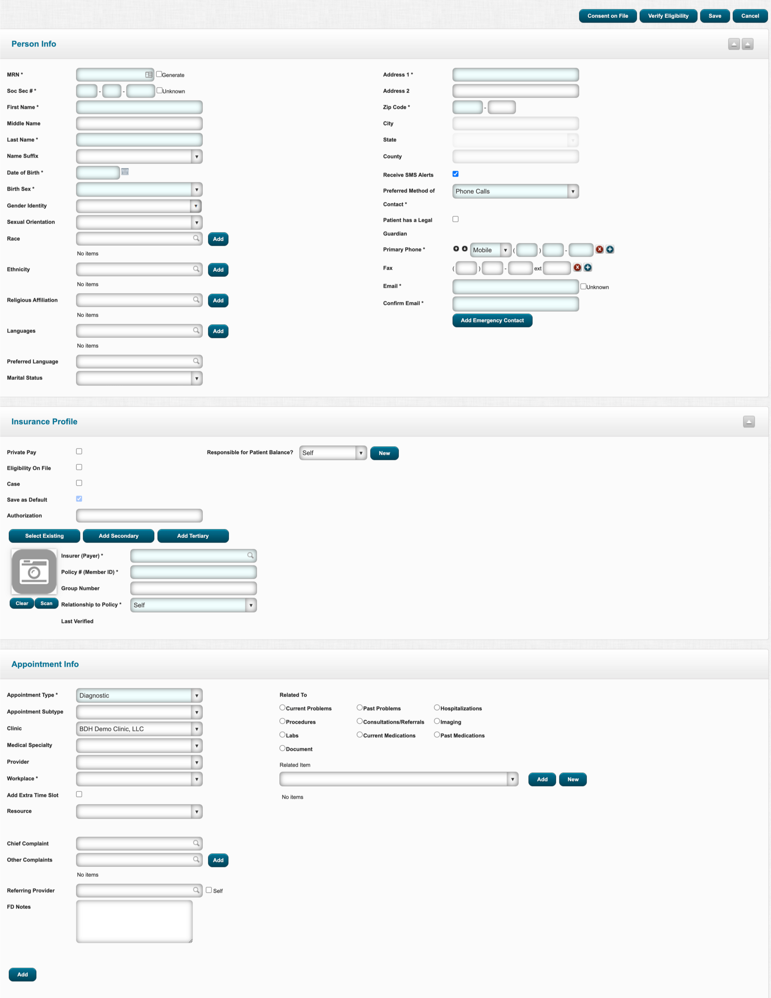
user must scroll all the way back up to save
two columns of info to input
is unintuitive
lengthy form on one screen makes form-filling daunting and burdensome
unnecessary input boxes in same hierarchy as required ones cause cognitive overload
“add” button after each
entry is tedious
form broken down into three pages with progress bar
info split into boxes based
on category
unused and unnecessary input boxes are removed from forms
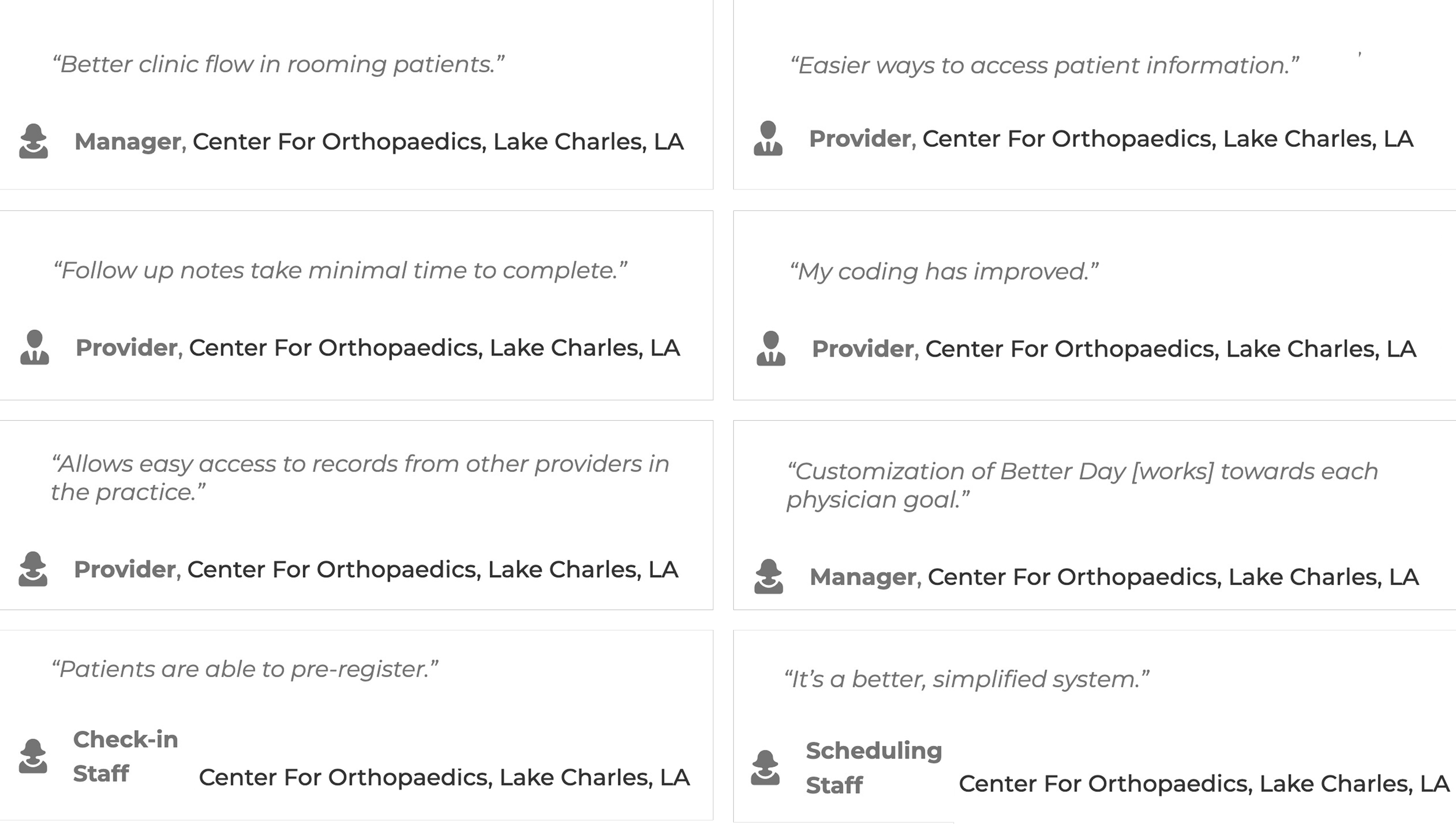
Impact
The design was handed back to stakeholders for feedback and iterations before development. Although some of the visual details were already chosen before I joined, I would use a different color palette, larger font and more contrast to improve accessibility.
The design system proved to be useful for efficiently carrying out the redesign and was used internally for future design work.
Practices adopted the redesigned tool and reported improved clinical workflows.
Check out my other projects!