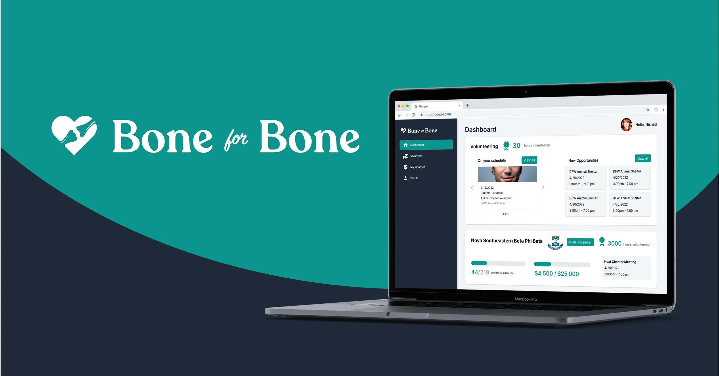
Creating a volunteer portal and nonprofit webpage to raise bone cancer awareness through our universal love for dogs
-
The Project
UX Design, Web Design
-
My Role
UX Designer
-
Timeline
Dec 2021 - April 2022
-
Tools
Webflow, Figma, FigJam, Adobe Photoshop and Illustrator
-
View Website
A “Joint” Effort
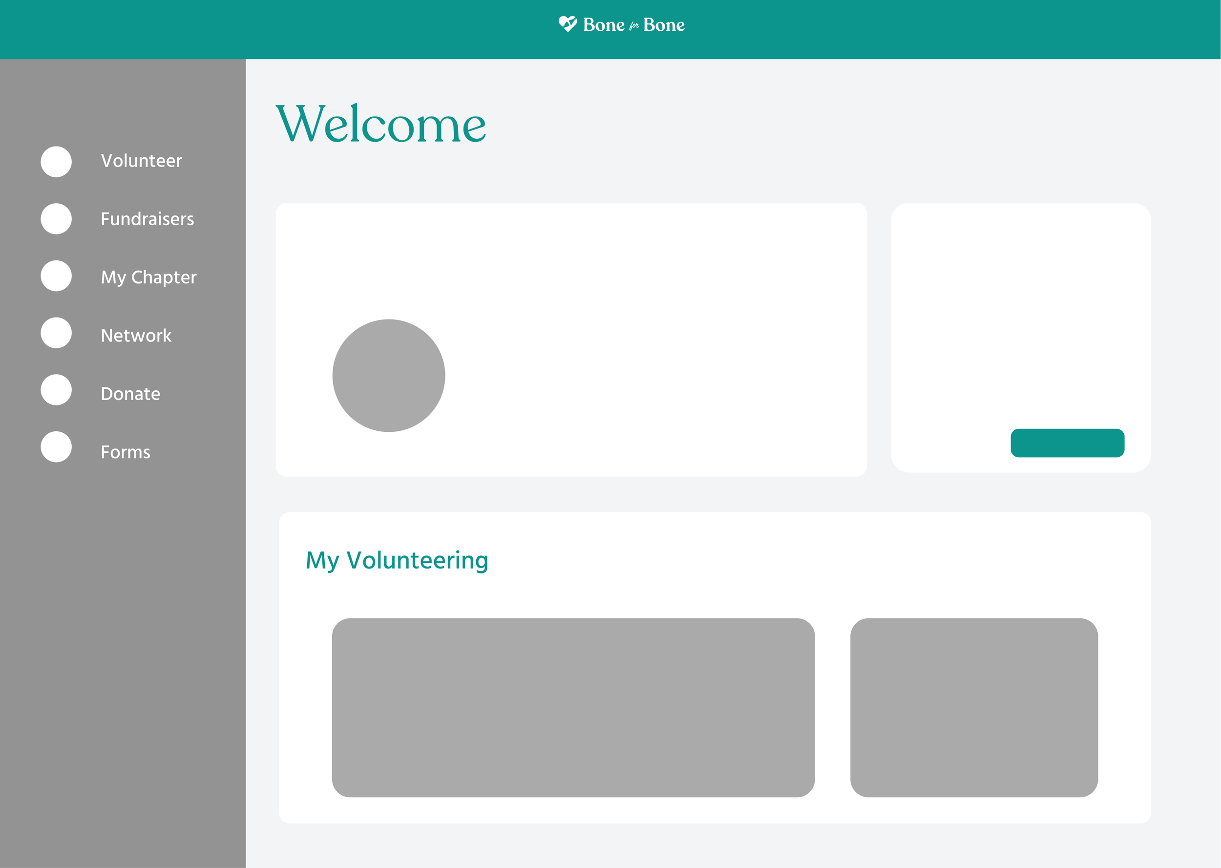
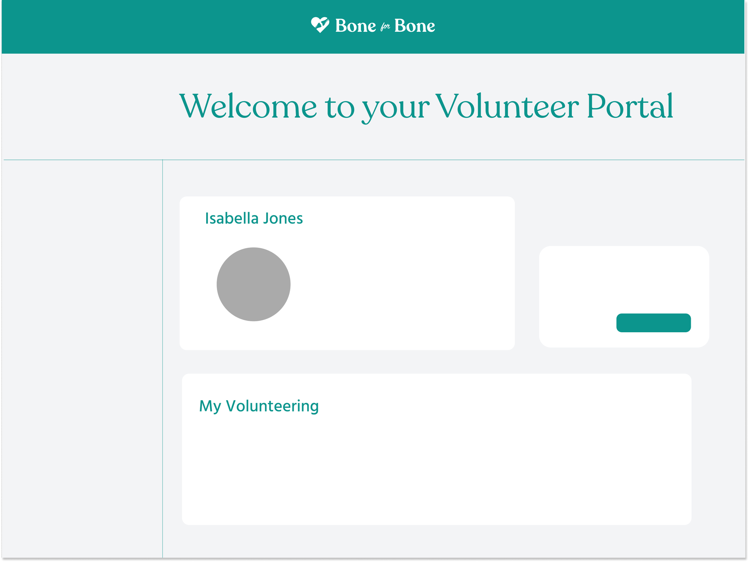
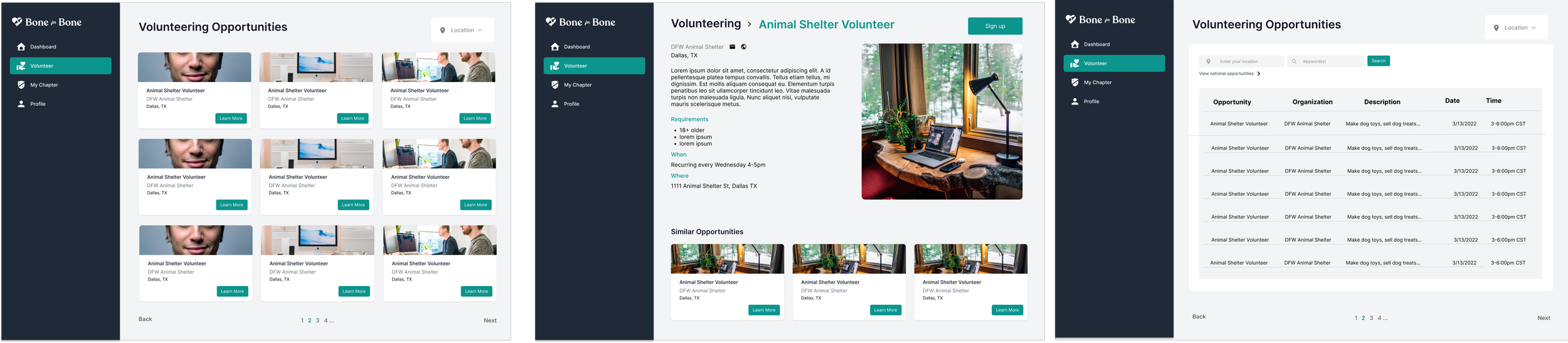
Bone for Bone is a non-profit organization created to promote bone cancer awareness through a universal love for dogs. The non-profit has established university-wide volunteering chapters and opportunities for patients, physicians, college students, and the ordinary volunteer.
Finding, signing up, and recording volunteer opportunities is a tedious process for the individual volunteer, and can discourage volunteering progress. The Bone for Bone volunteers need a webpage and portal in order to:
access local and national opportunities
engage in a professional network
host fundraisers
shop for dog products and merch
Our User
Getting to know the main user groups helped me to create a user-centric, accessible volunteer portal that complements each volunteer’s unique needs.
The initial design is created for university chapter volunteers and the independent volunteer. The portal will be used by volunteers belonging to a Bone for Bone chapter.
User Needs
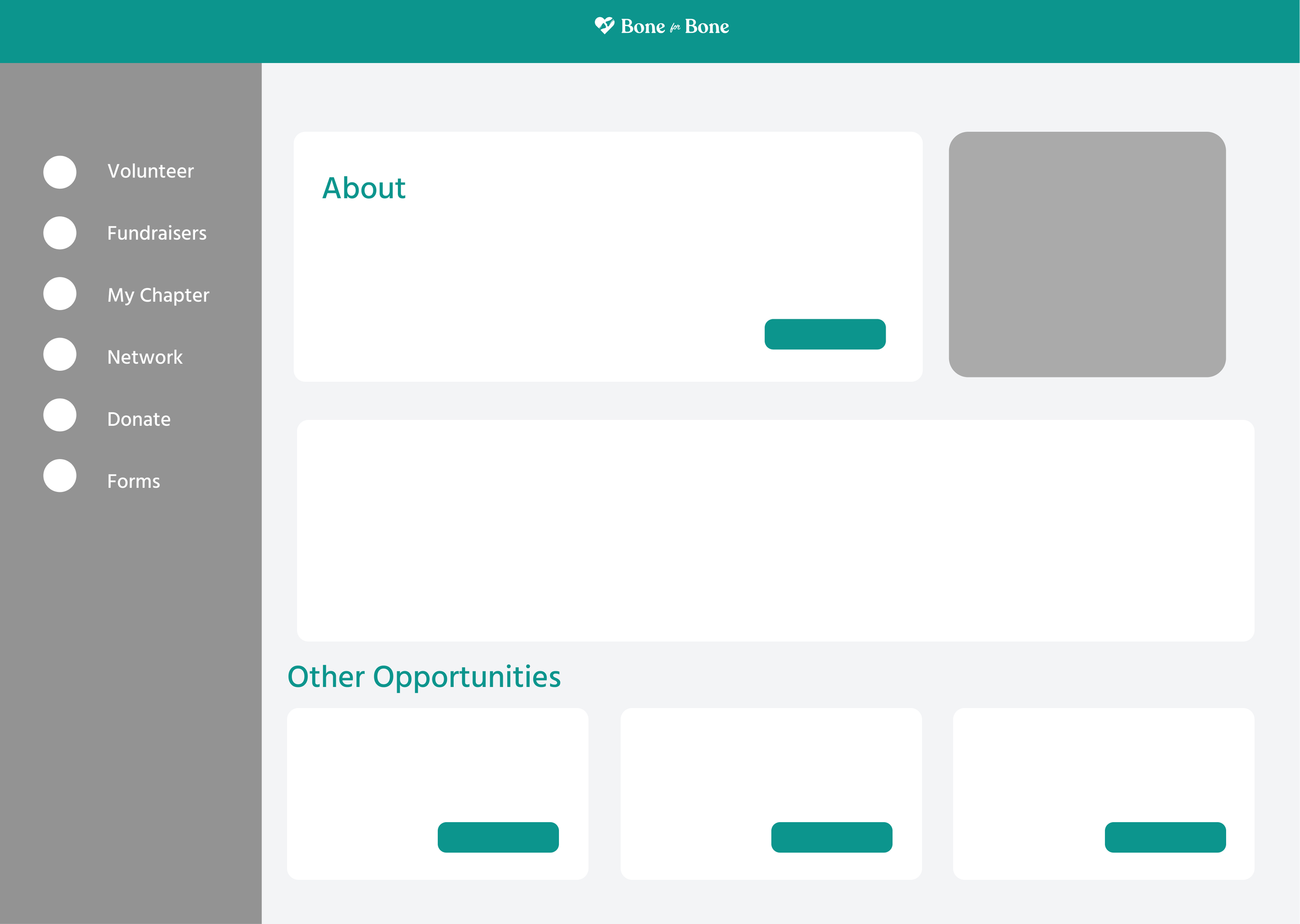
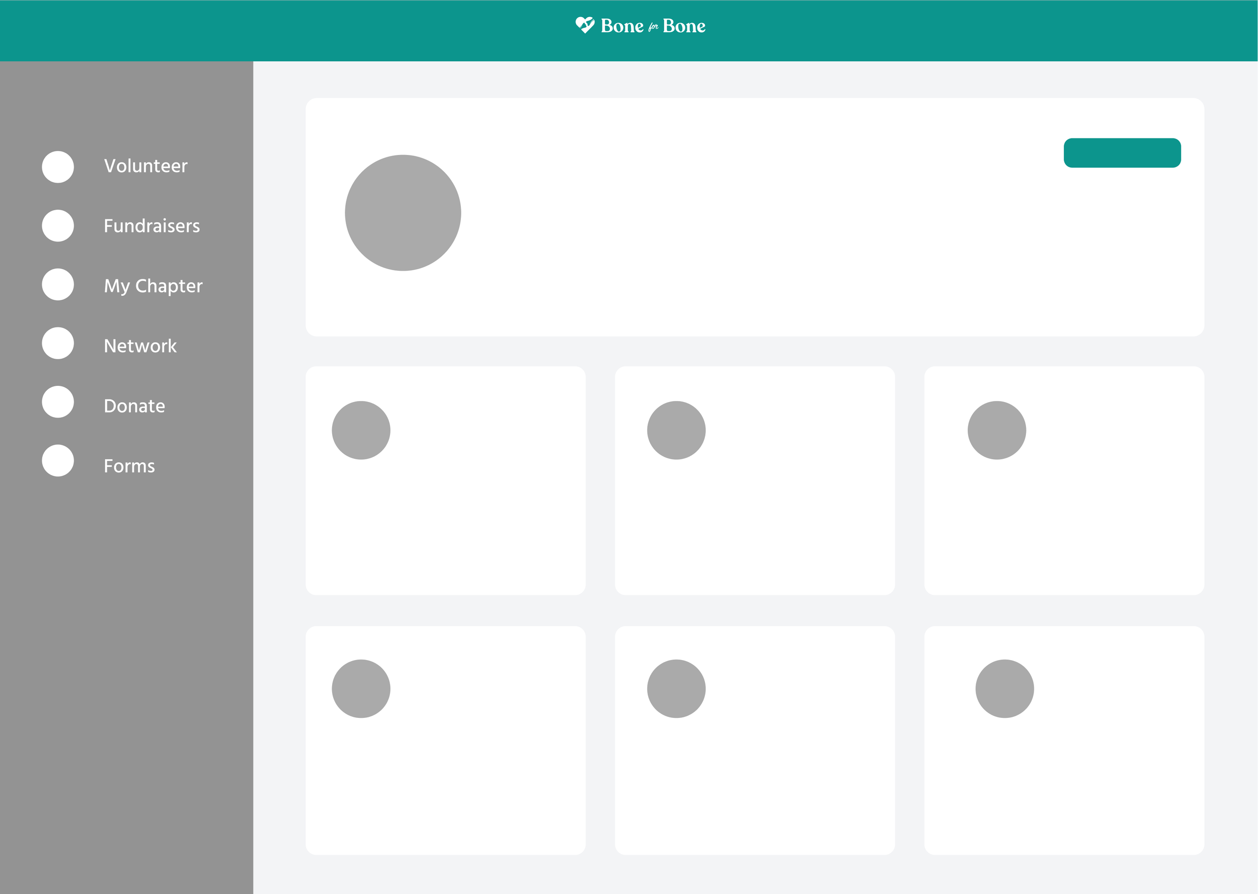
discover, sign up and modify local volunteering opportunities
engage in a network with other professionals and volunteers
track hours, receive a reminder and view a calendar

User Journey Map
I outlined the user’s actions and corresponding emotions to carry out the task of signing up for volunteering. I then translated pain points into opportunities for a strong design.

Site Map

Lo Fi Wireframes
I began to simplify the sign up/log-in screen. In doing so, it became more clear what was missing.
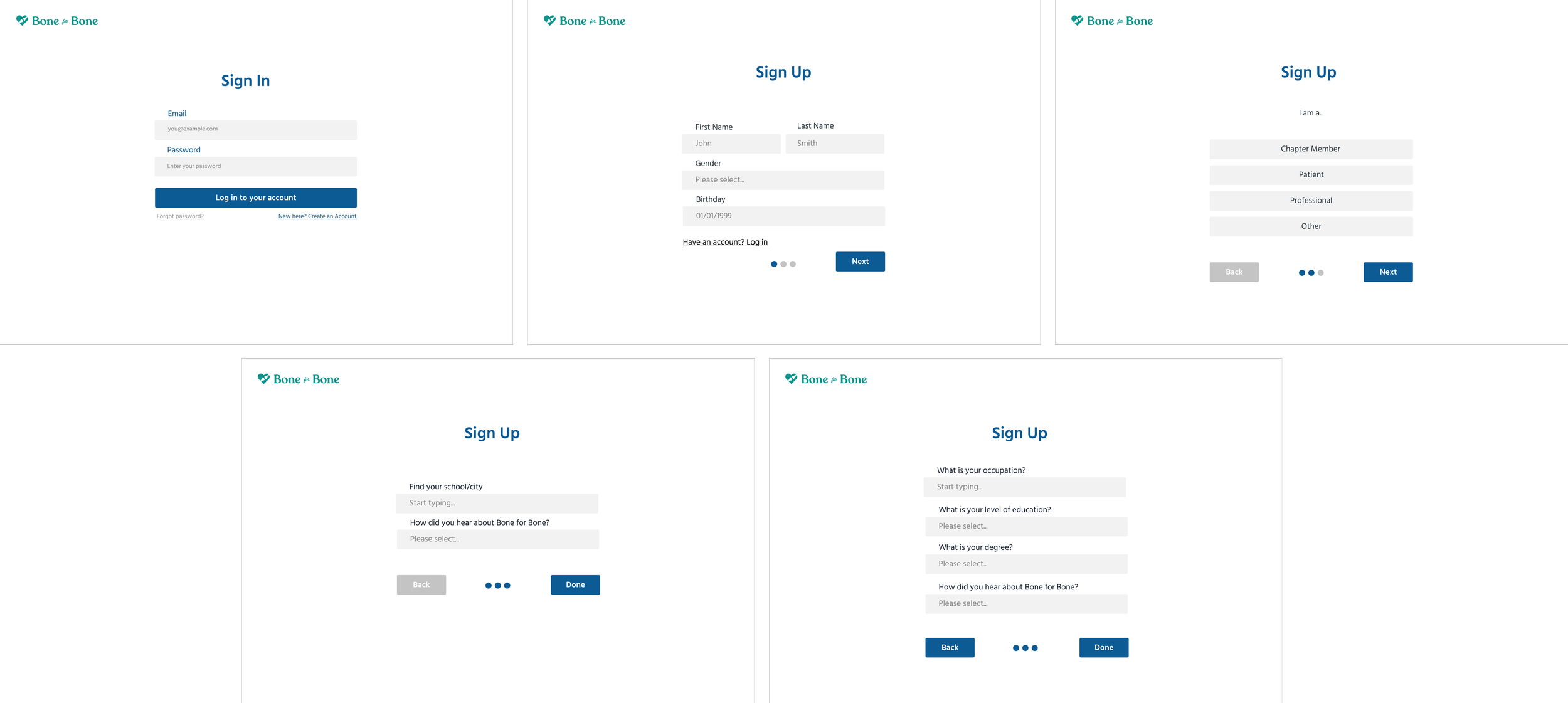
Onboarding
While incorporating UX writing, I realized we needed more options for user groups during the sign-up. This information needs to be collected early on to display the corresponding design of the dashboard to meet the user group’s needs.

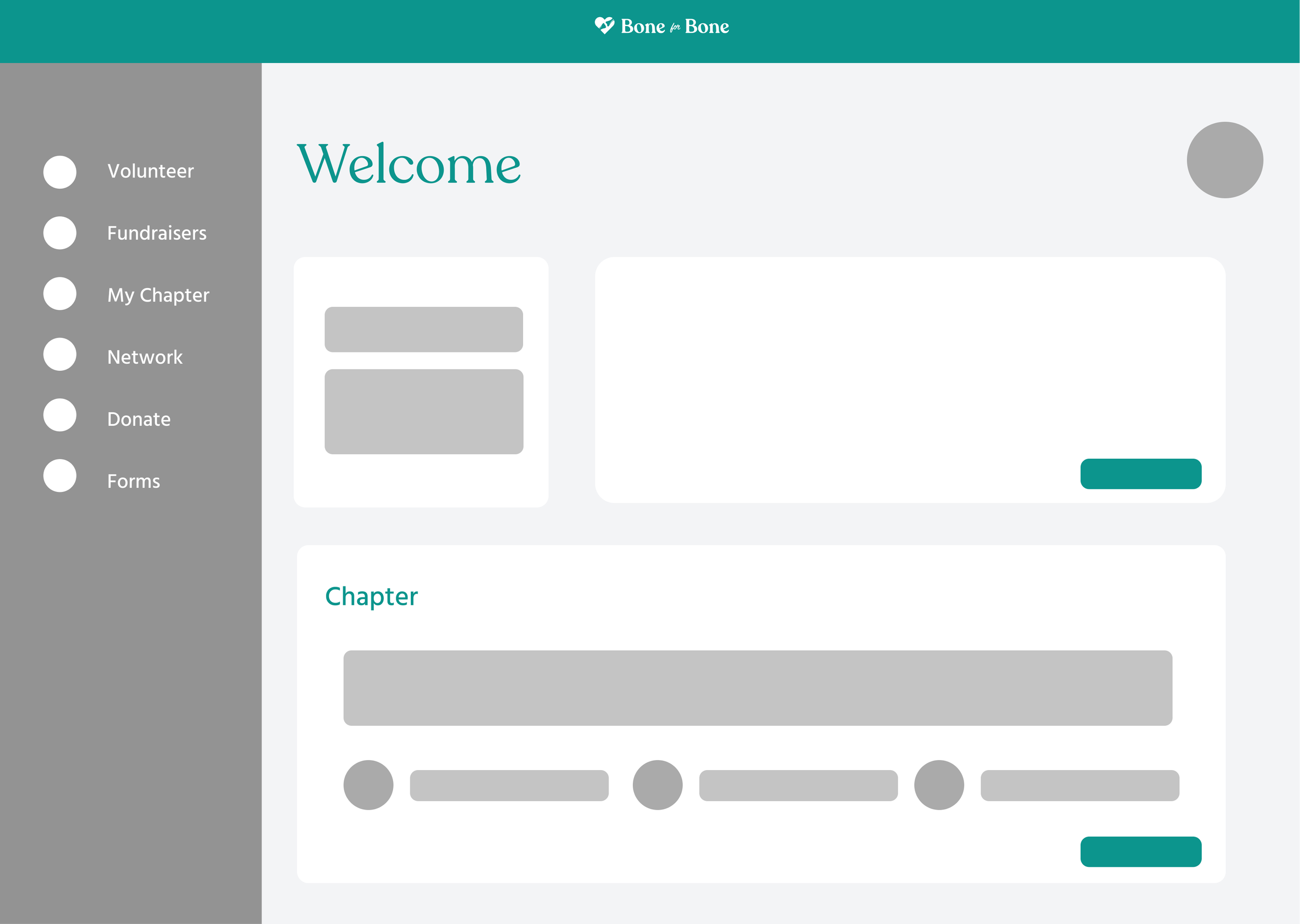
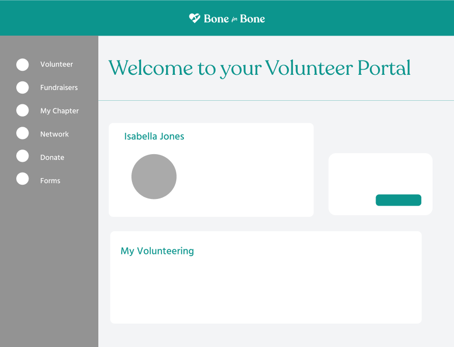
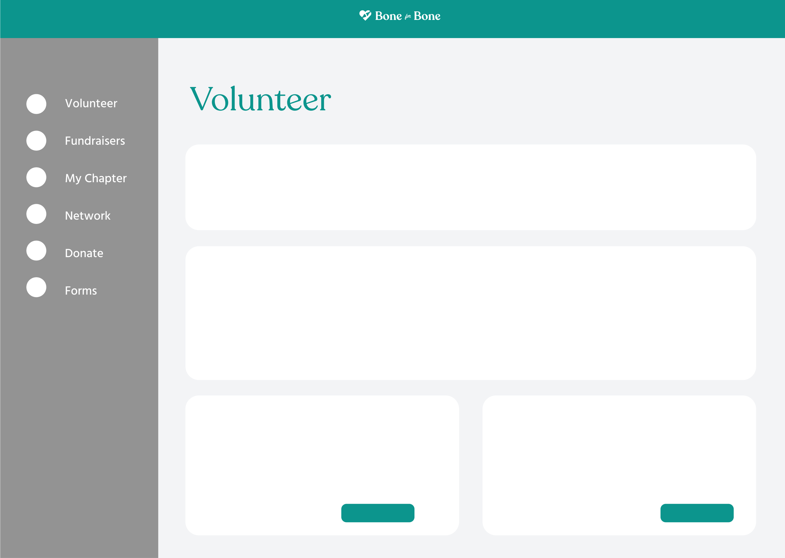
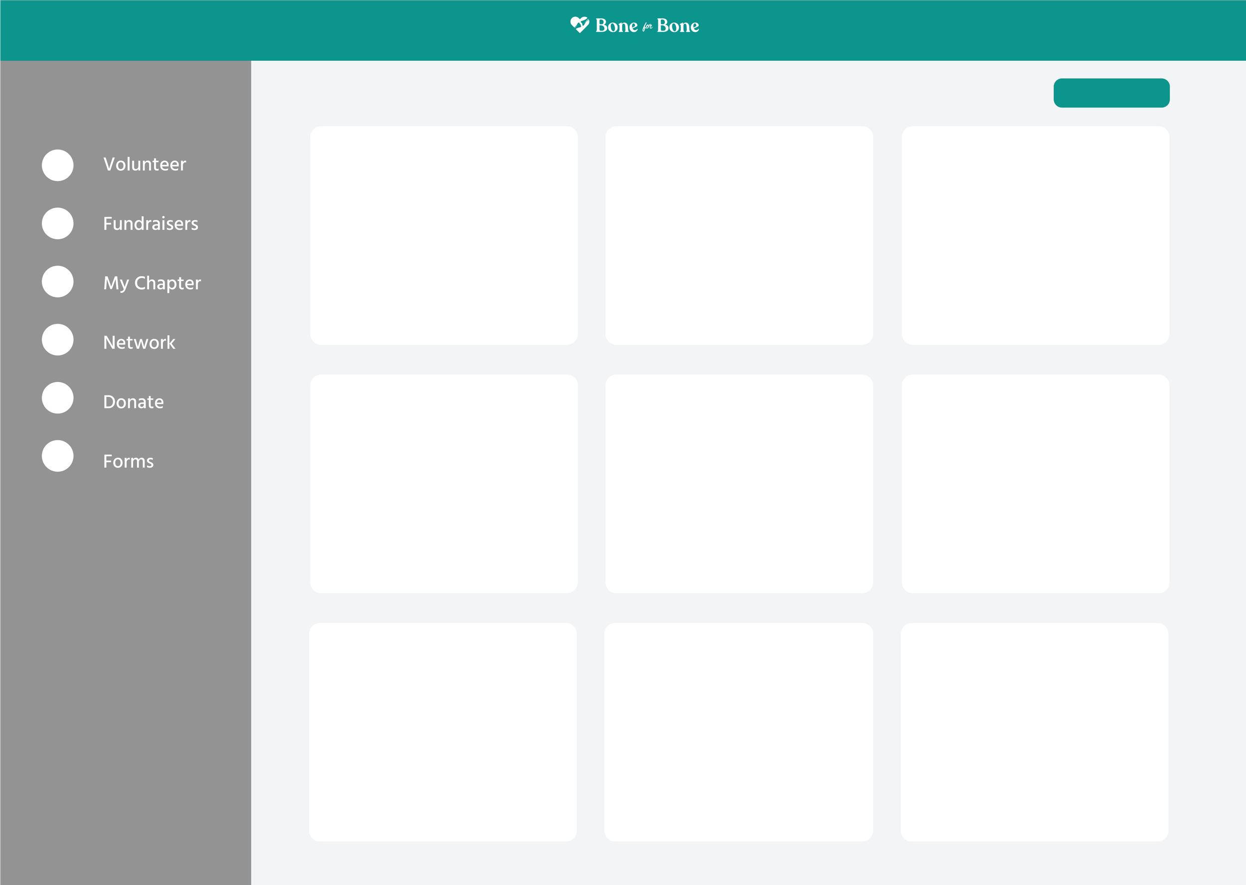
Medium Fidelity Wireframes
Onboarding
Profiles
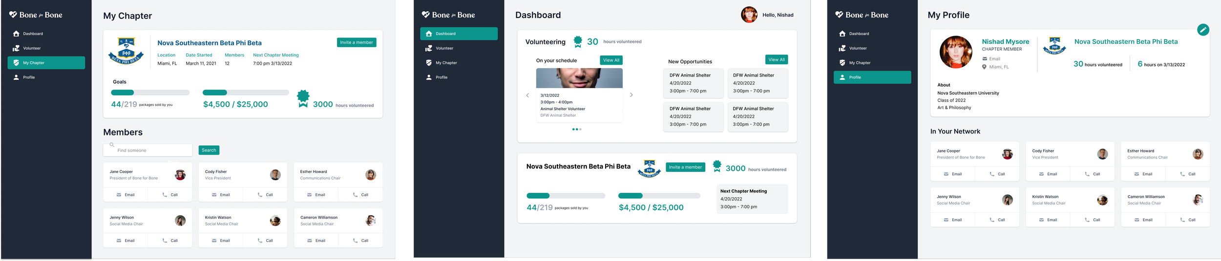
Volunteering
Key Takeaways
For my first UX design project, in addition to building proficiency in Figma, I learned some important lessons for good desing:
User Centered: Thinking from the perspective of the user influenced all of my design choices, from laying out the information, the navigation panel, the browse feature, use of buttons, progress bars, breadcrumbs and more.
Adaptability: There is always a trade-off in choosing between certain features. I learned that no product is complete in its first iteration. It’s best to not get married to any one design, and prevent lost effort by simplifying early design.
Foresight: Some logistical issues such as the volunteer sign-up requirements, different user groups, and the search page did not arise until later on. It’s best to get a clear understanding of the scope and technicalities before designing, as some details can be easily missed.
Check out my other projects!